
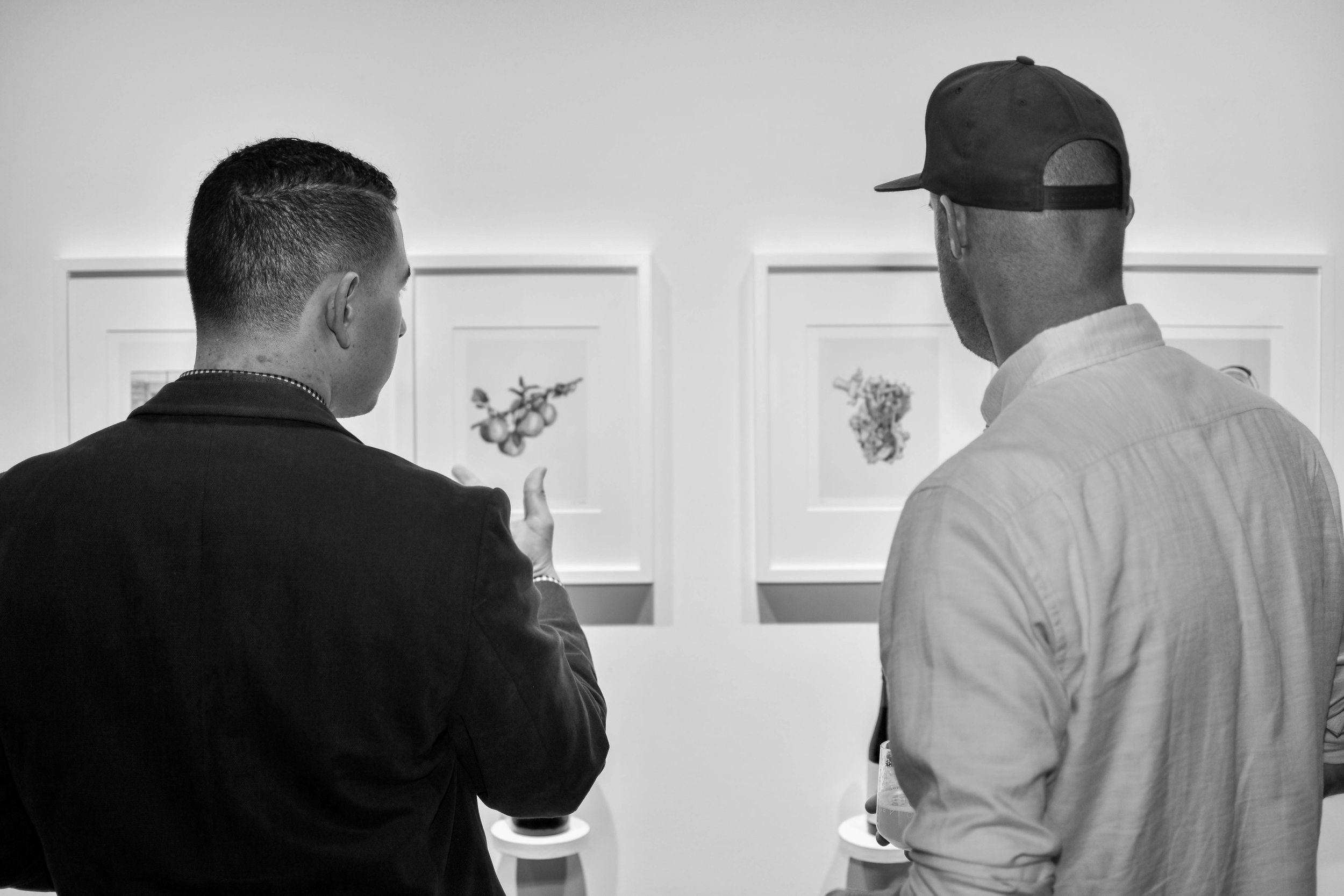
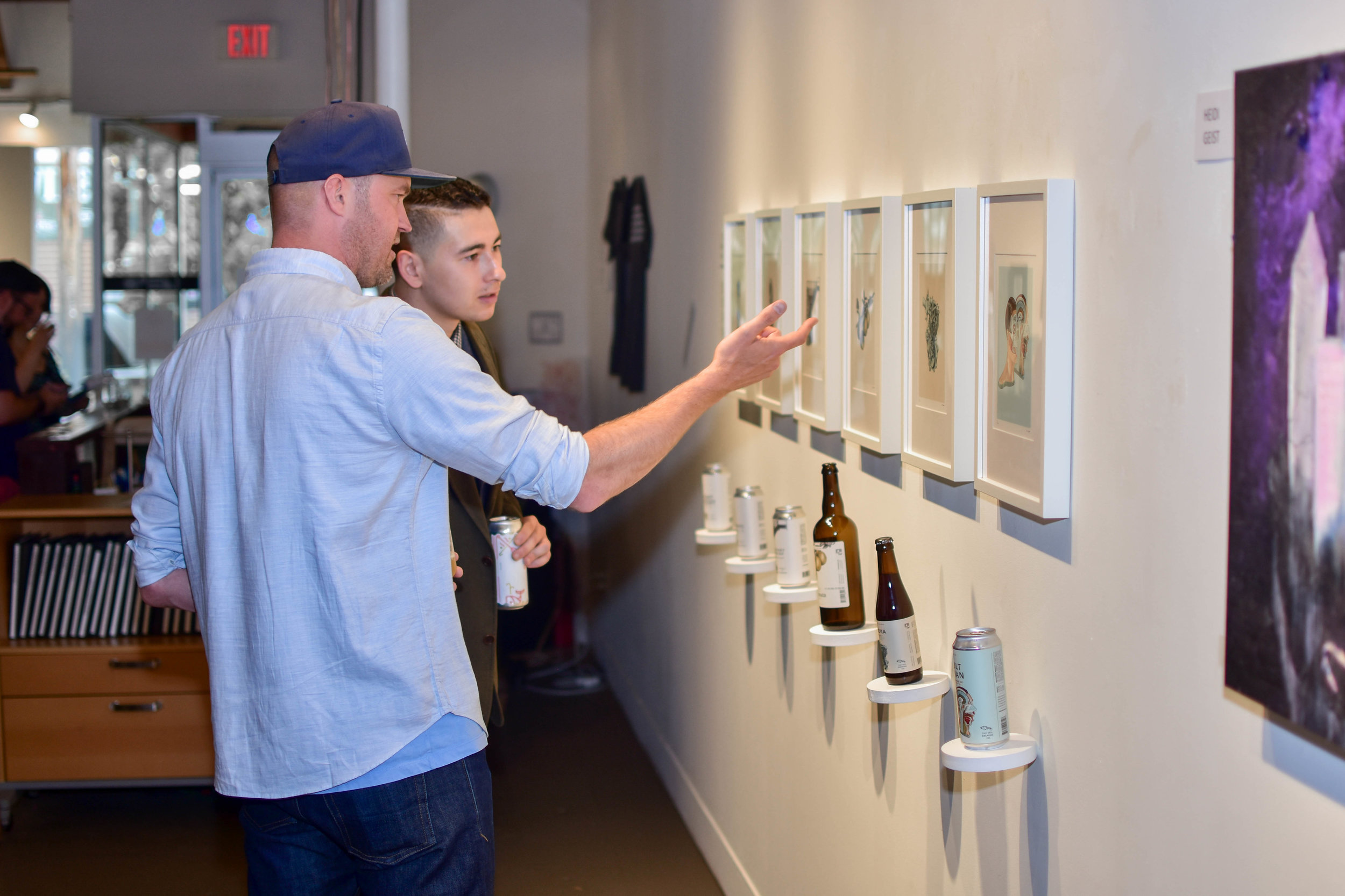
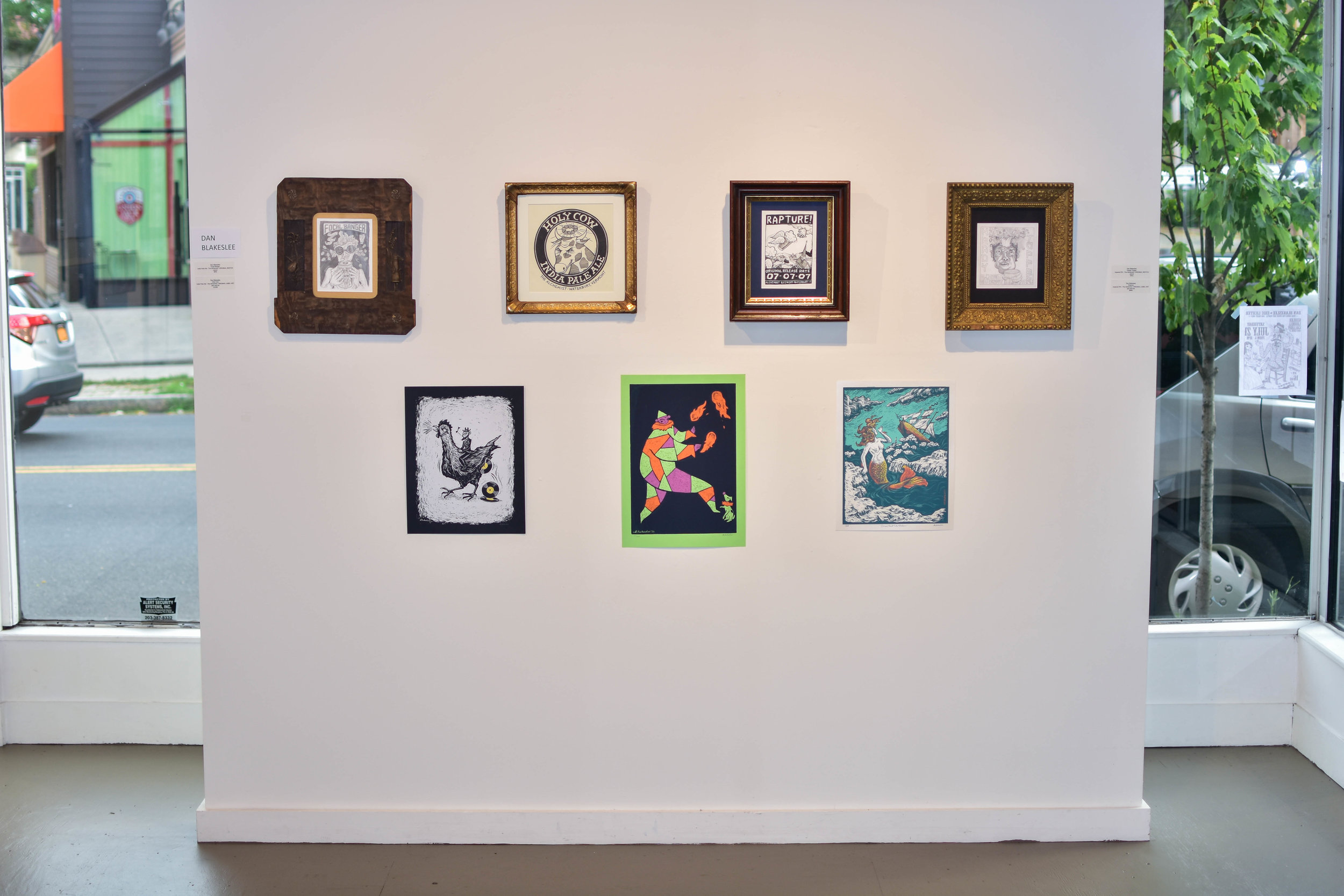
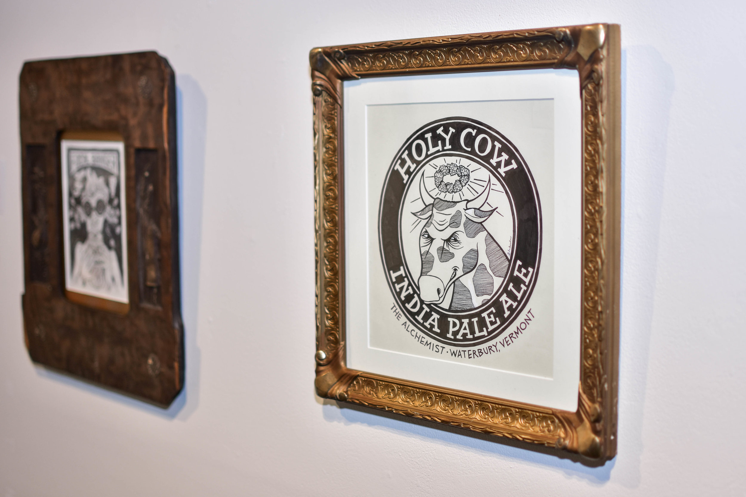
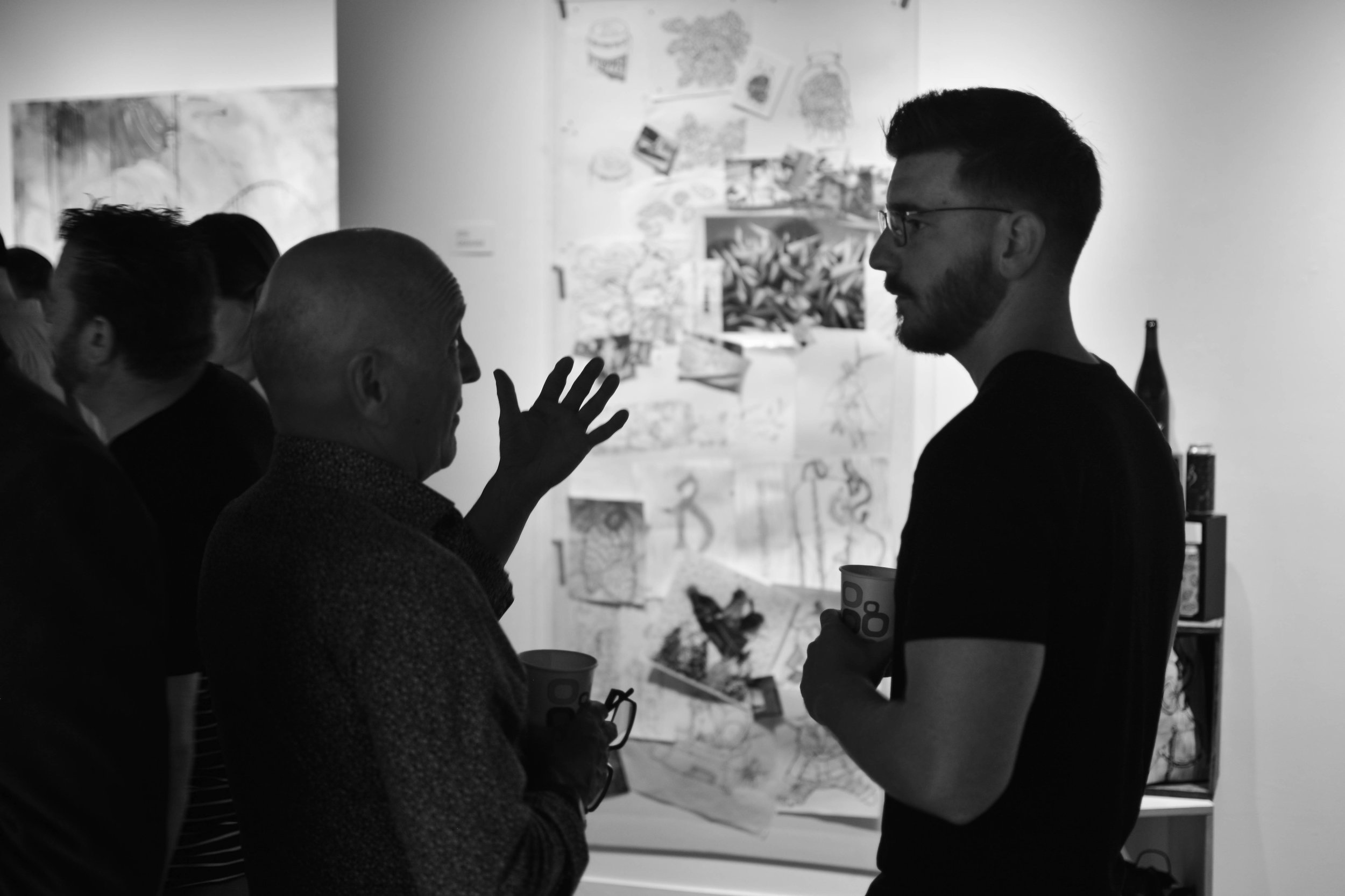

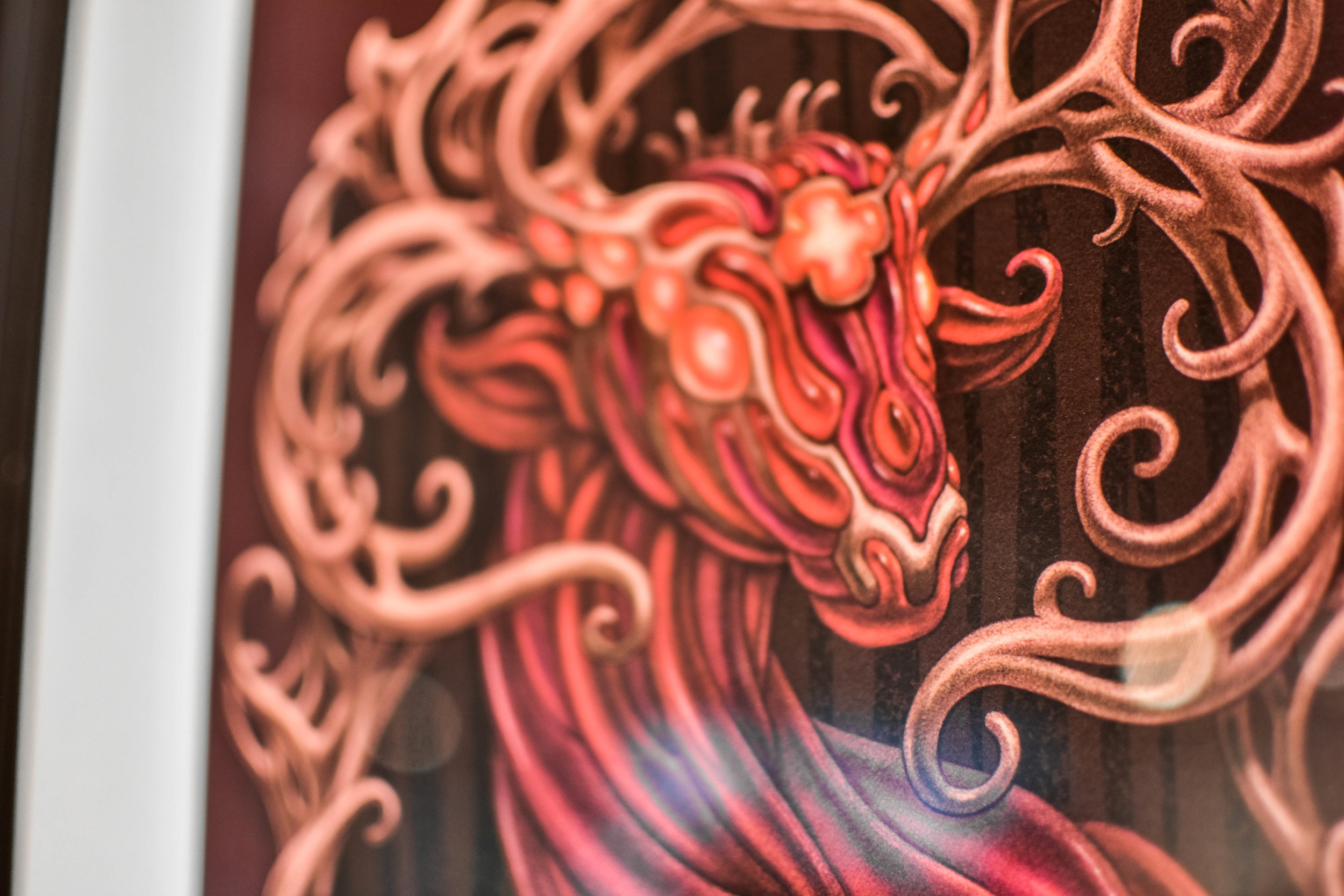
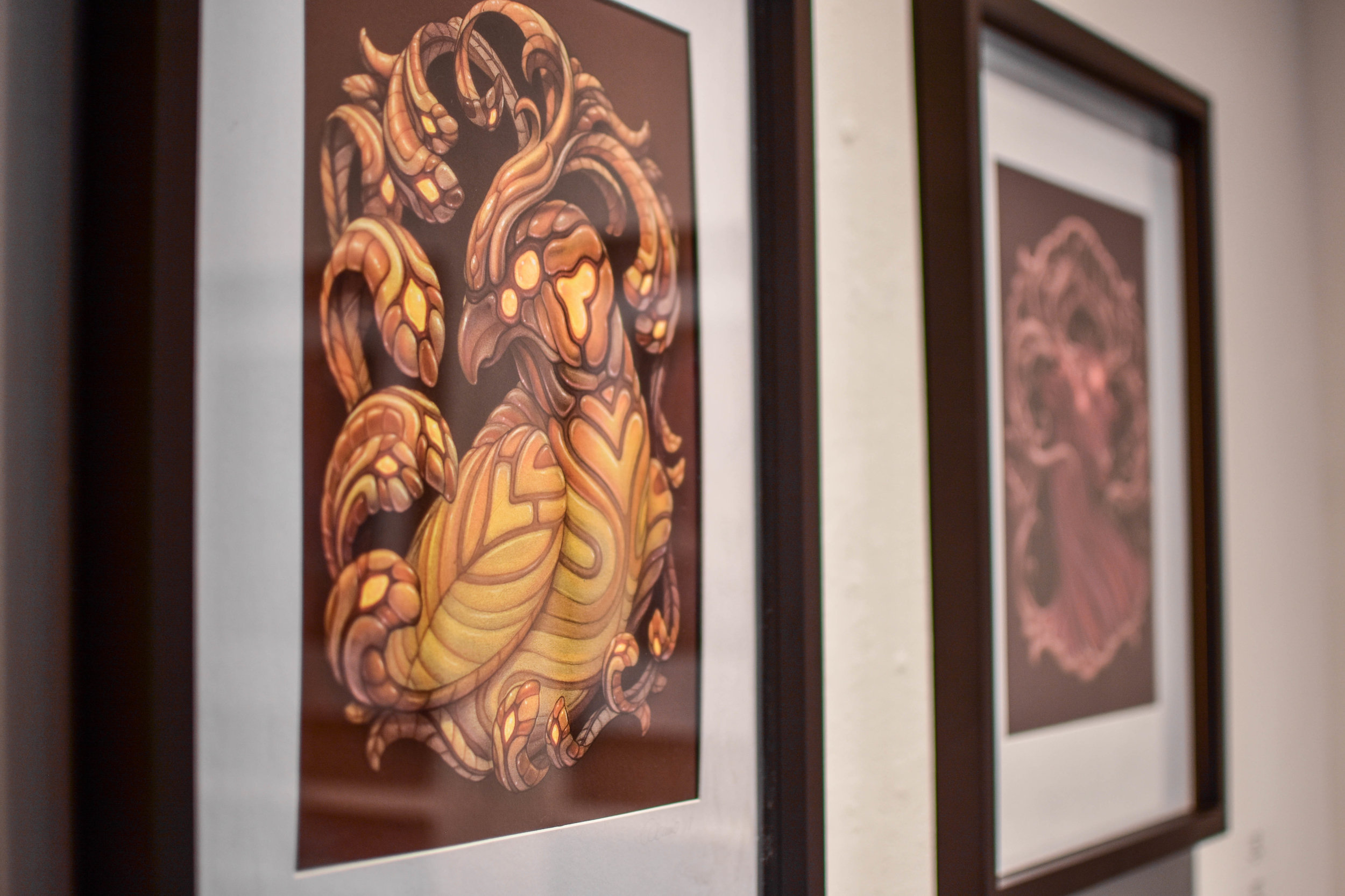
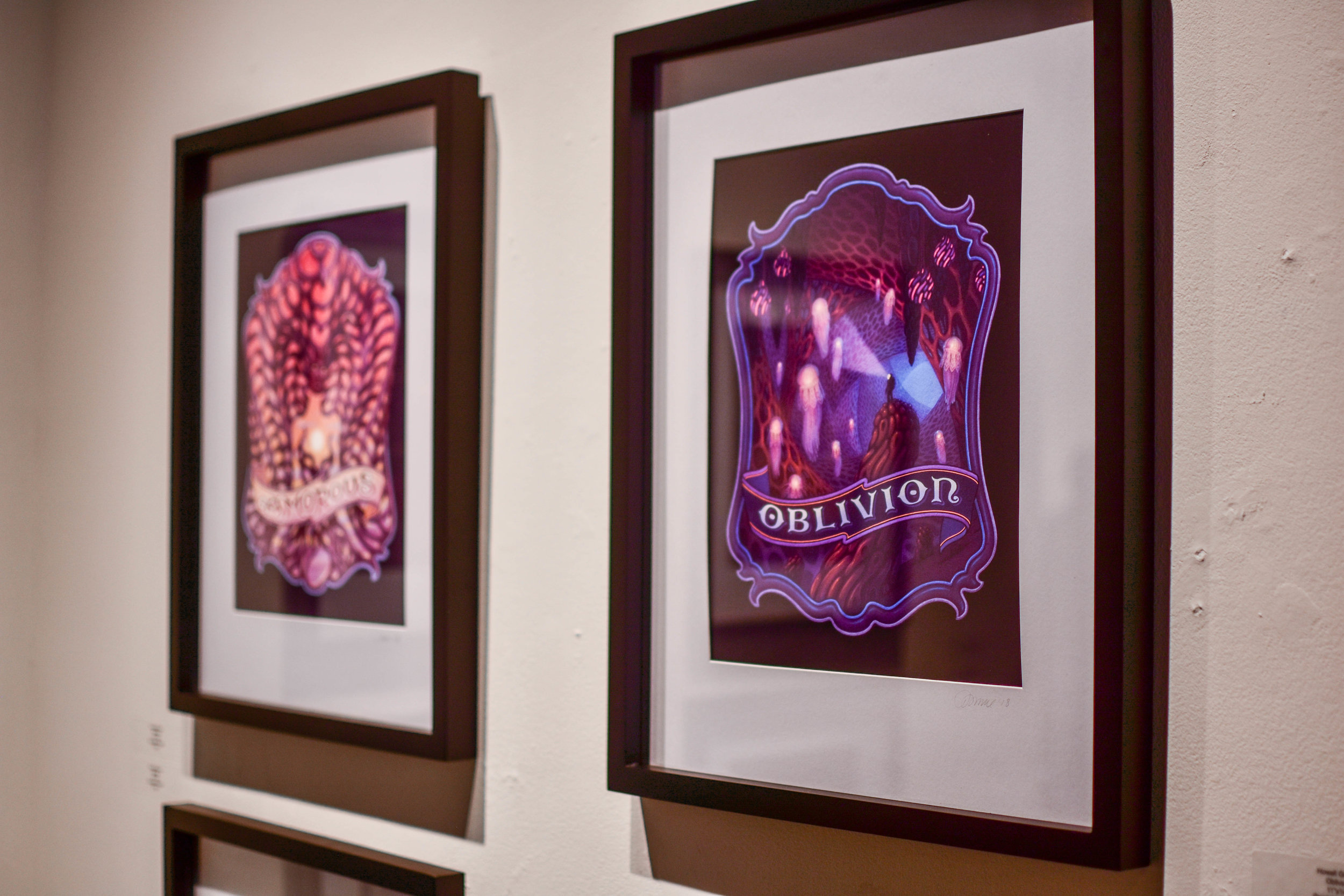
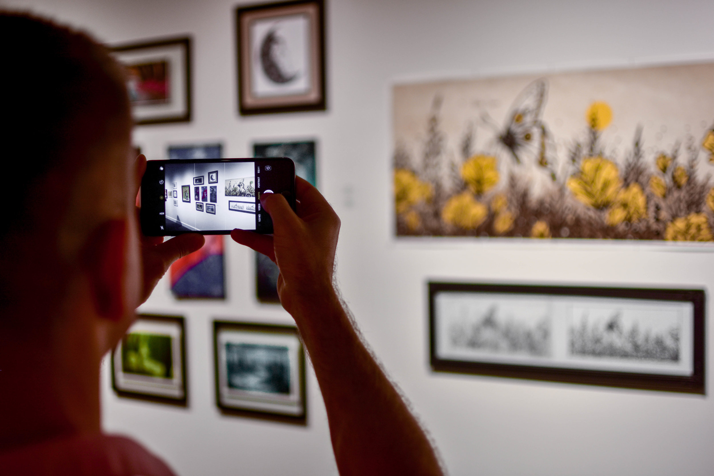

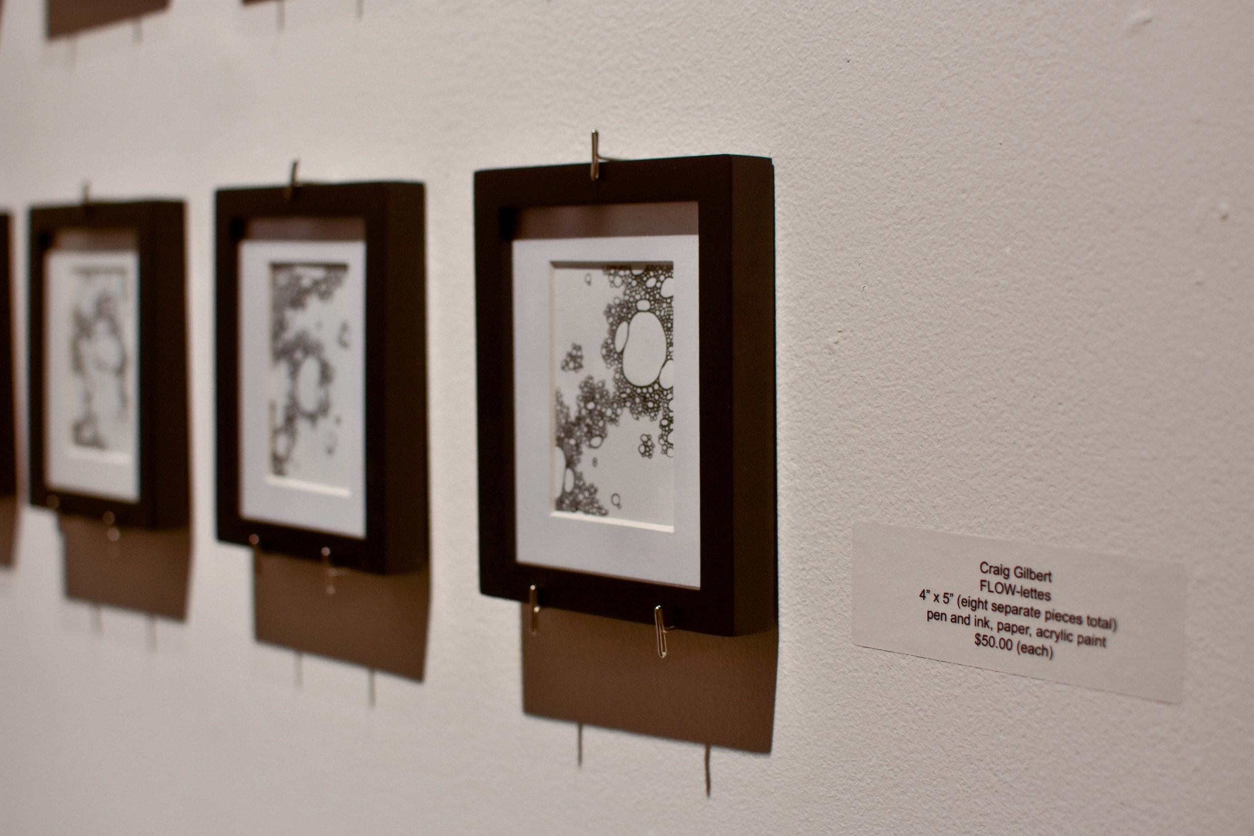

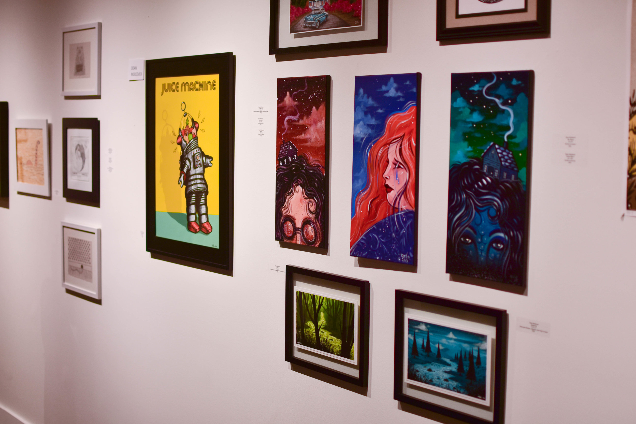


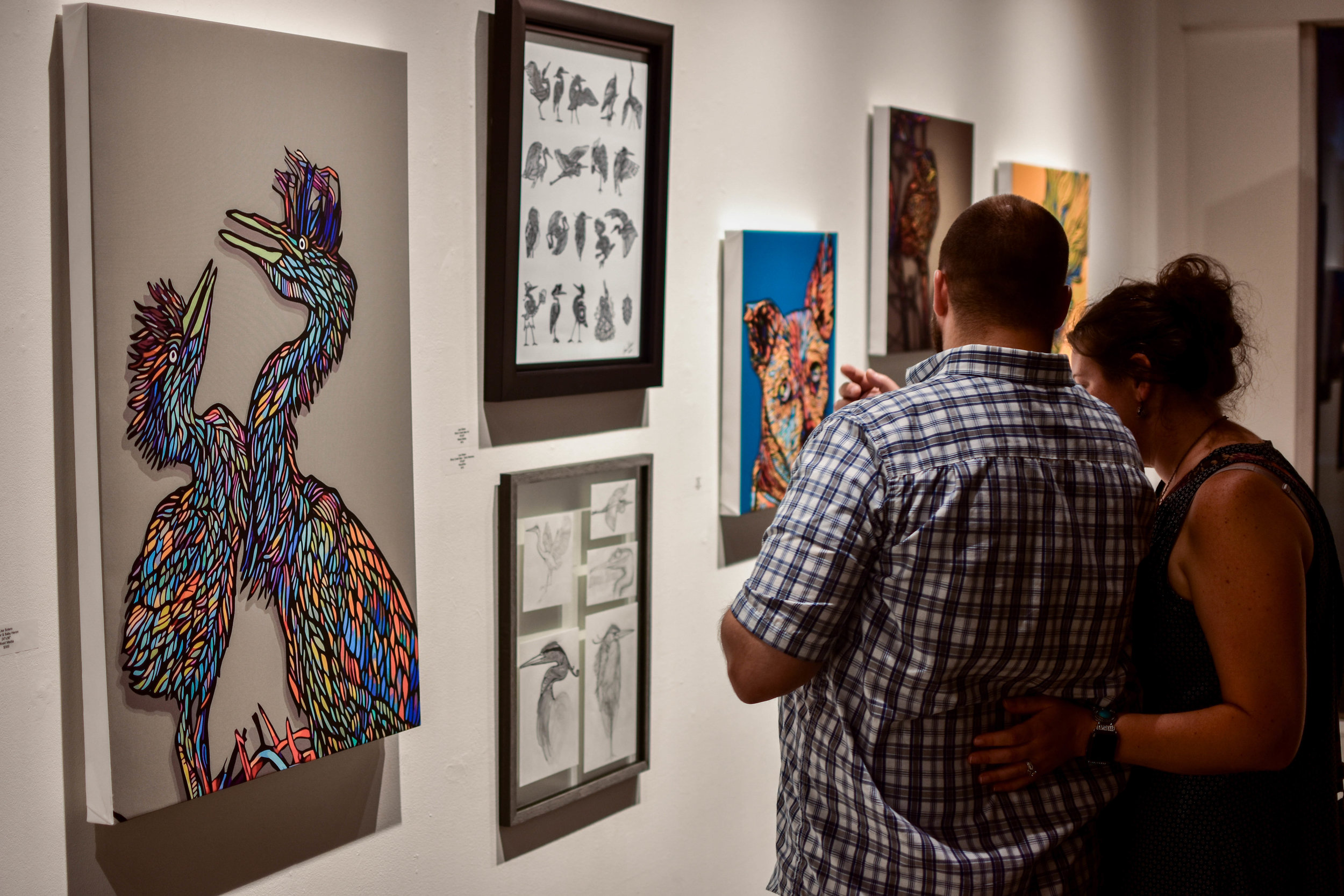
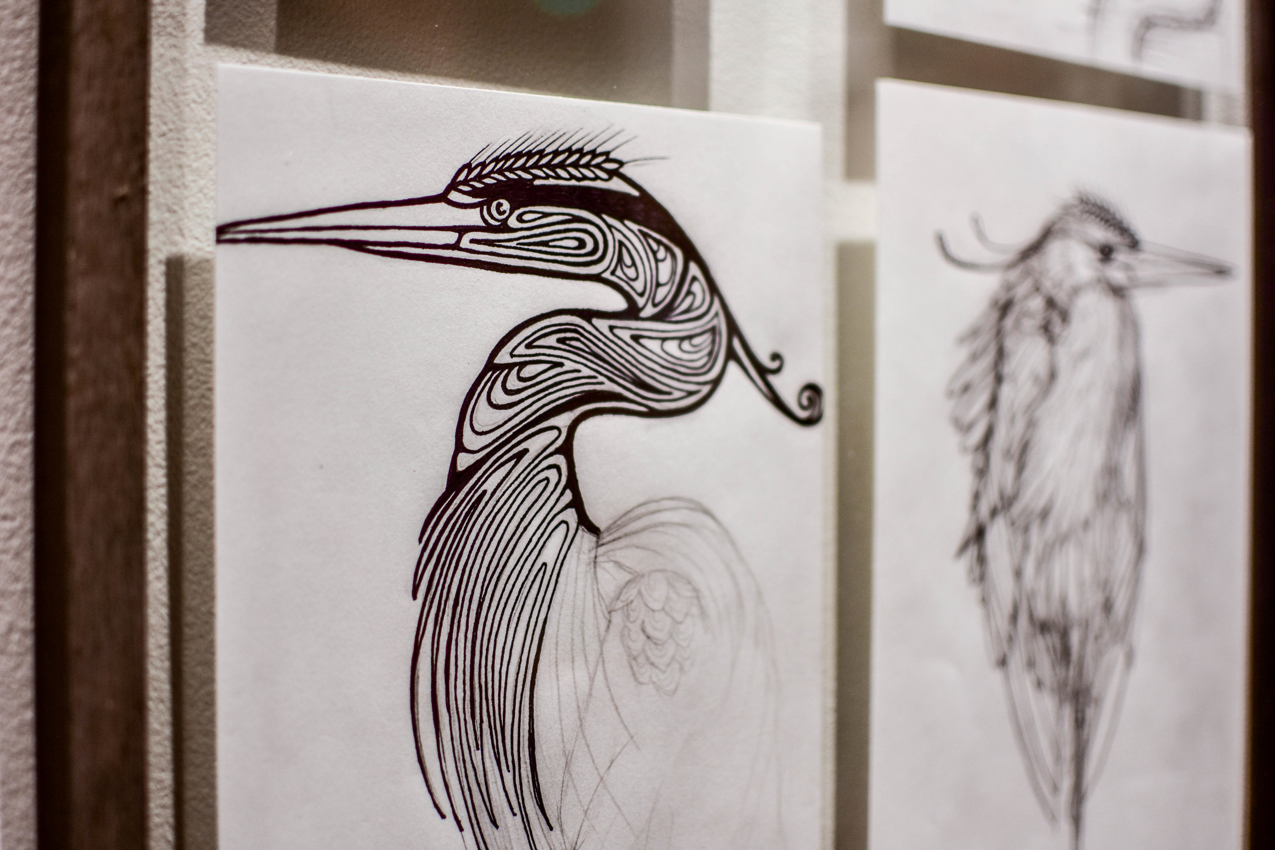
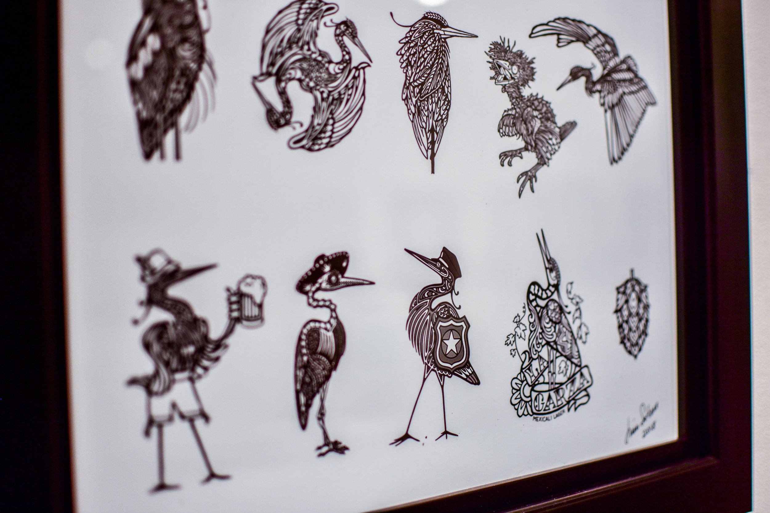
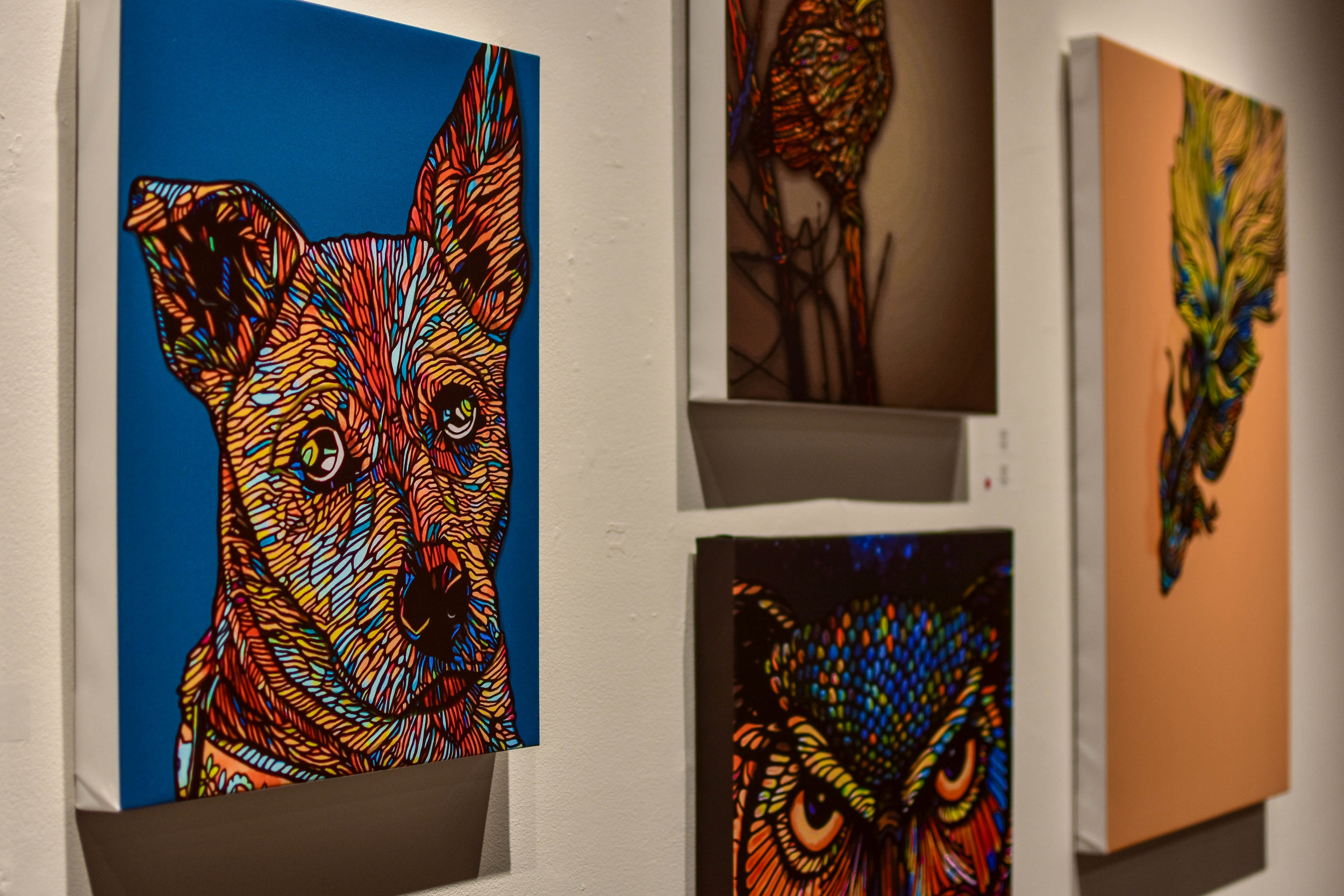
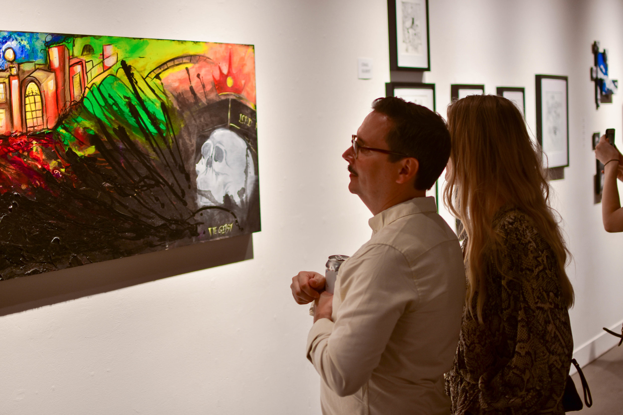
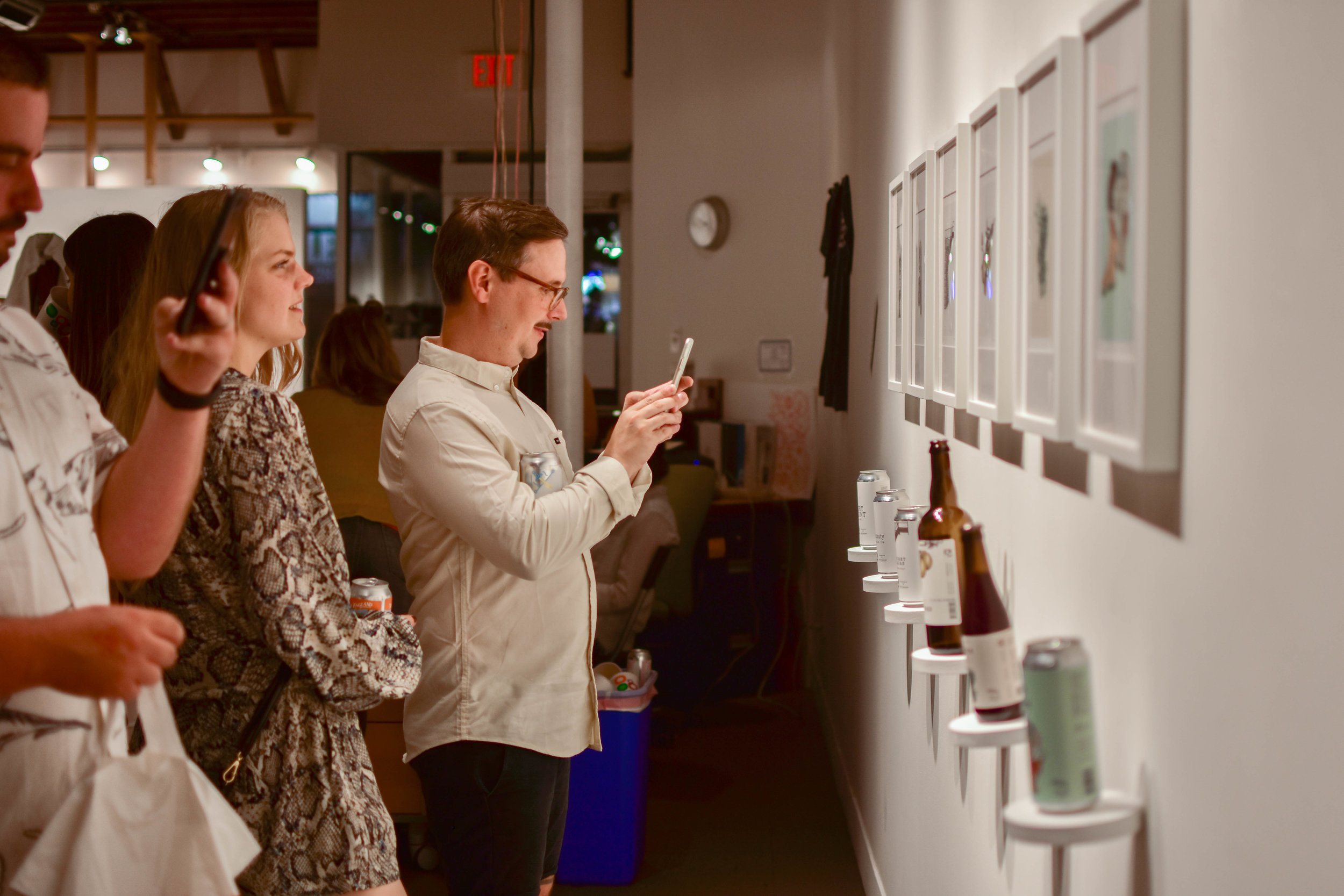
in their own words plus pictures
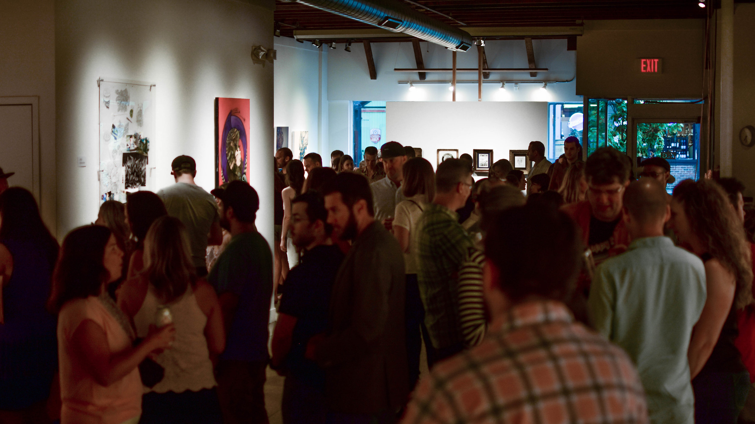
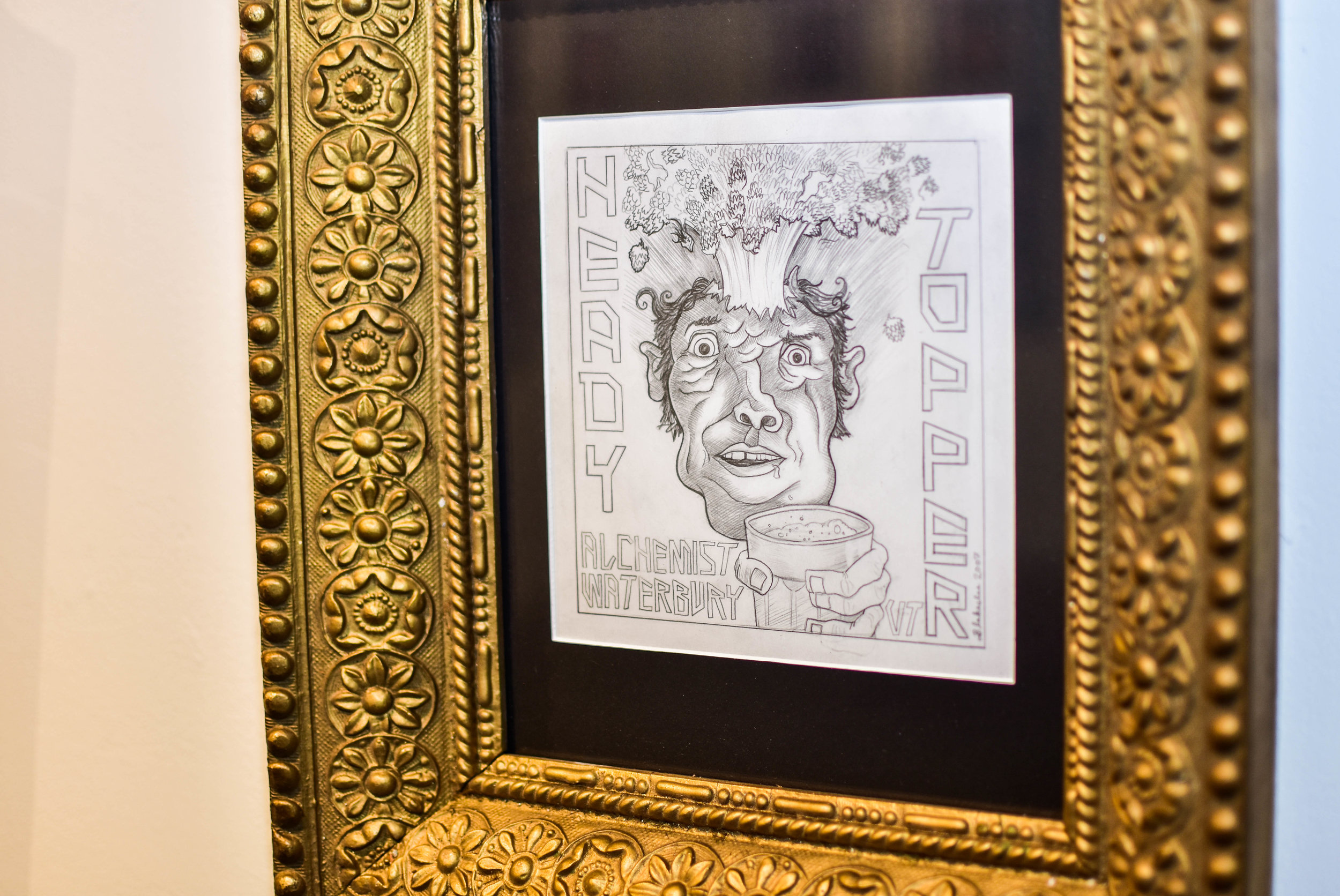
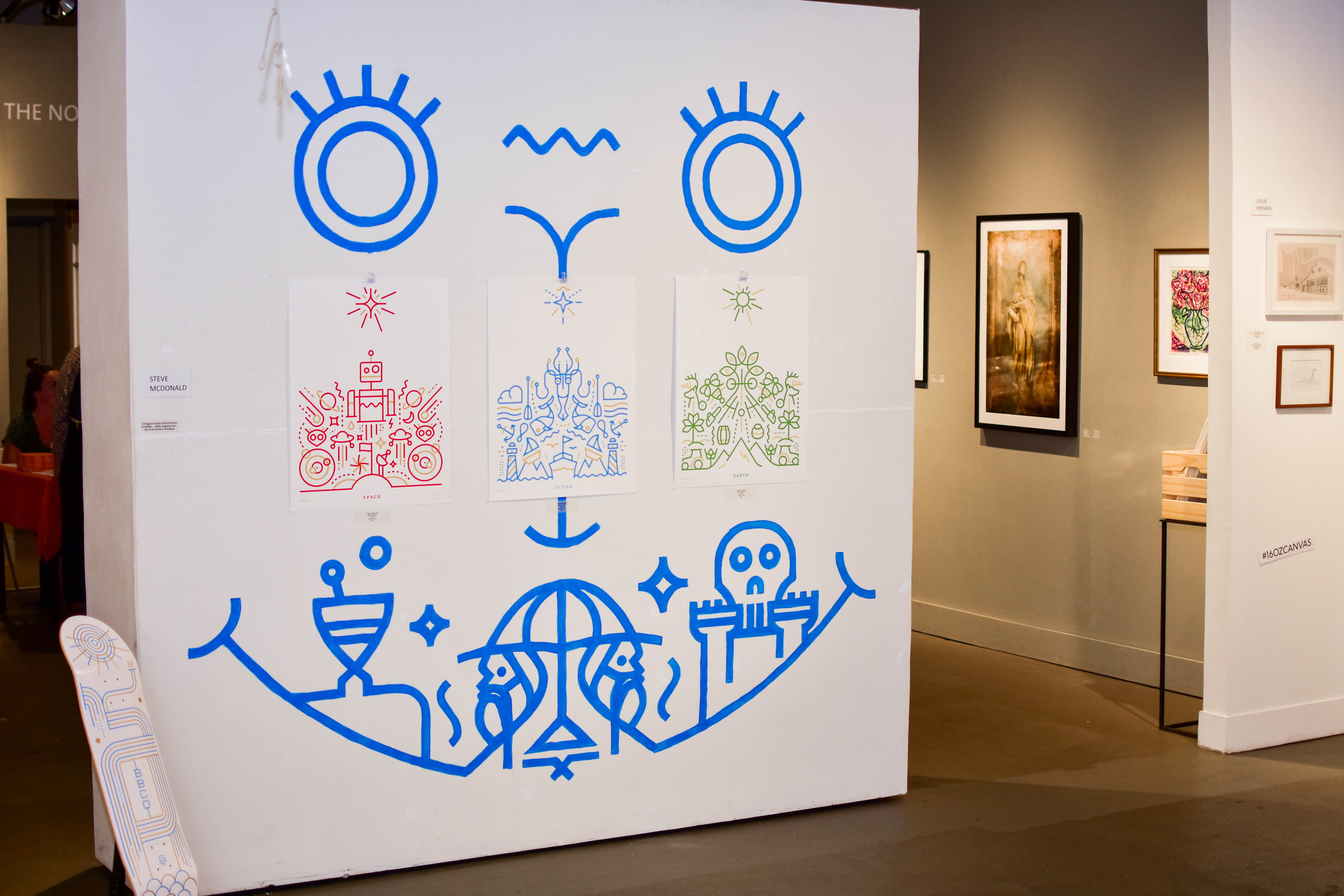
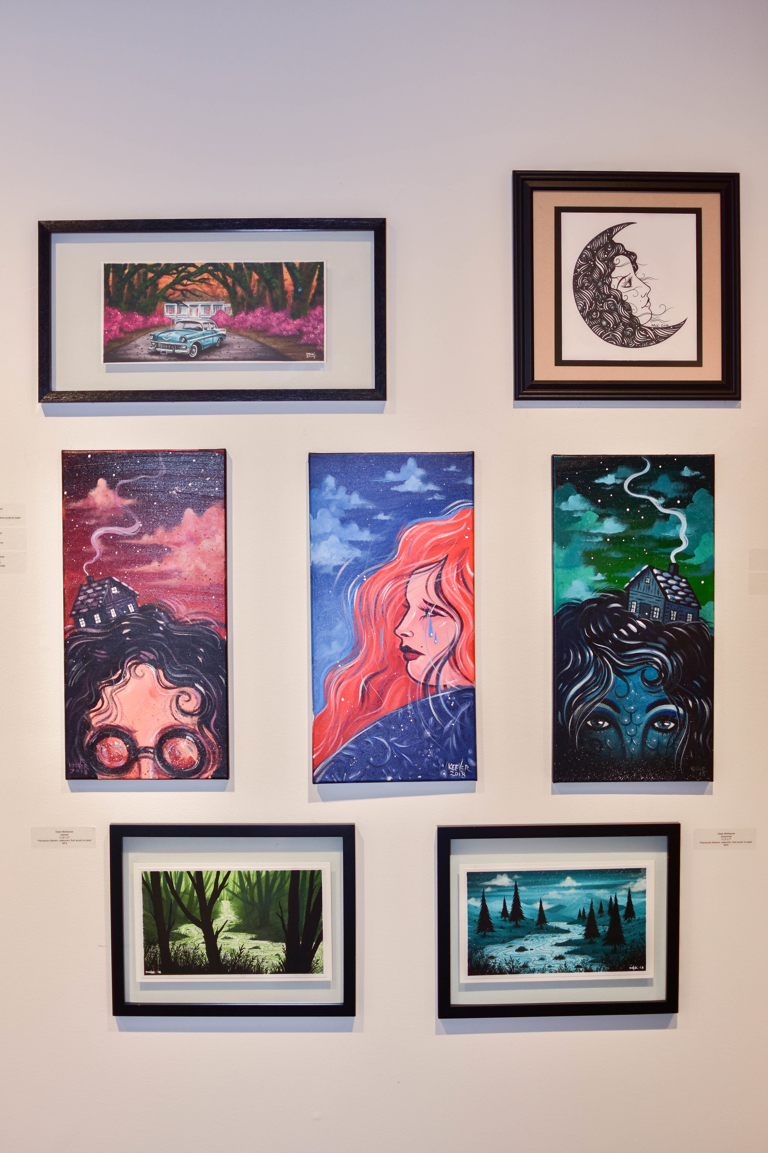
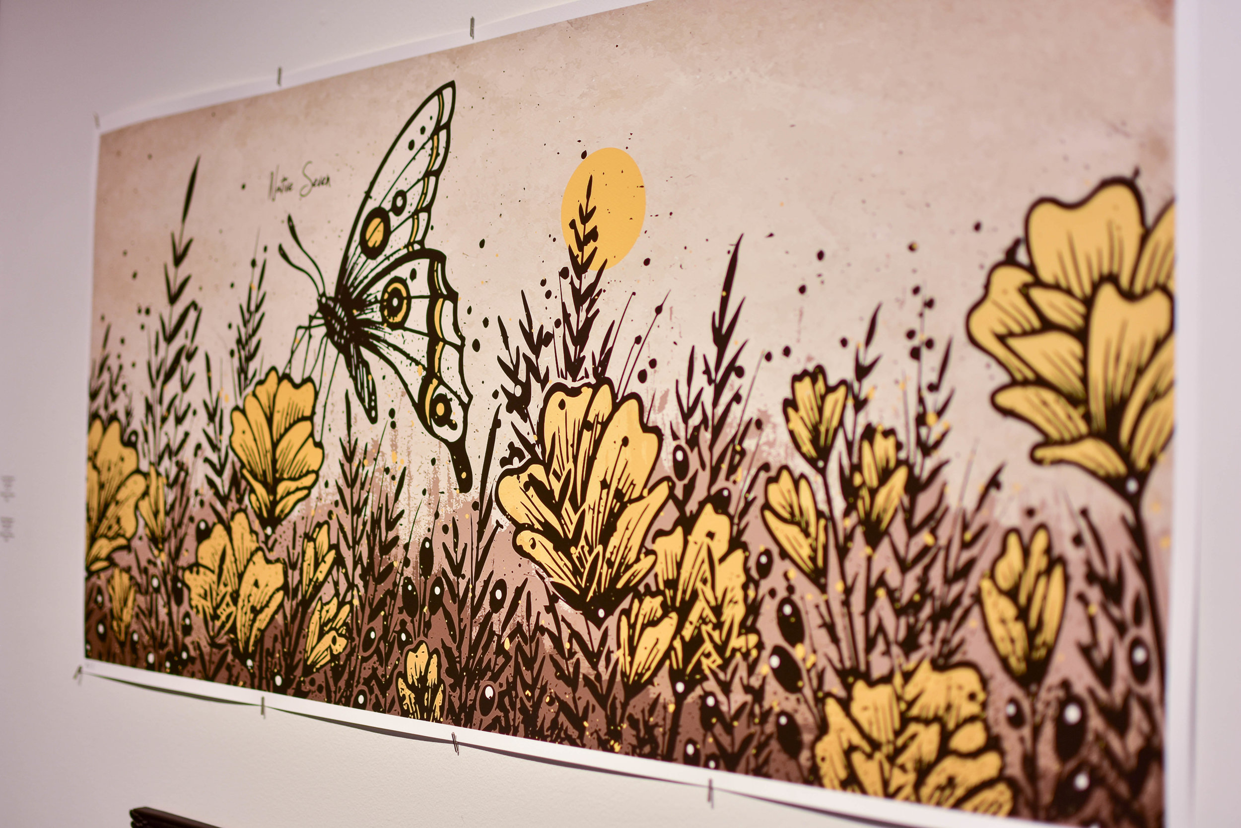
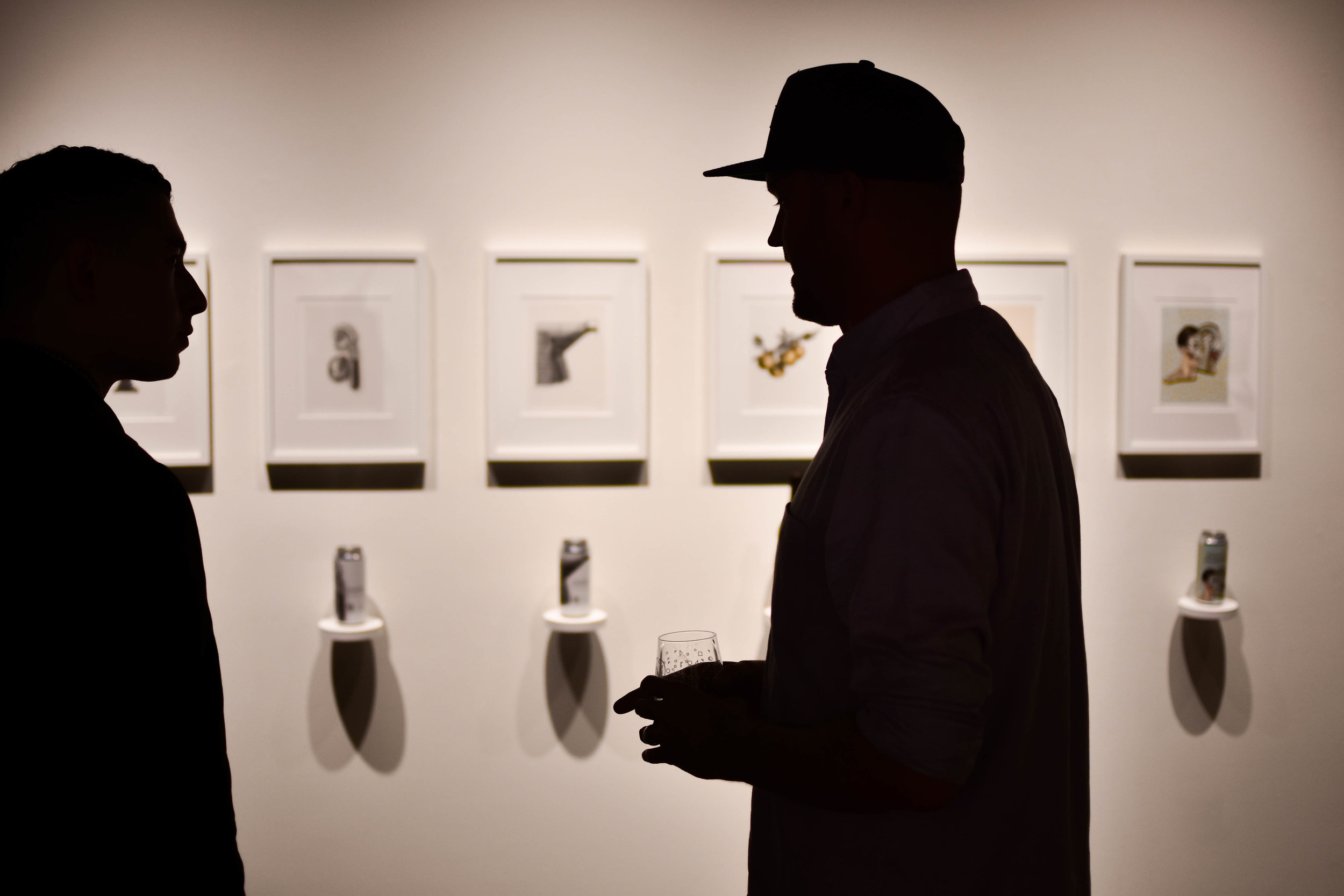
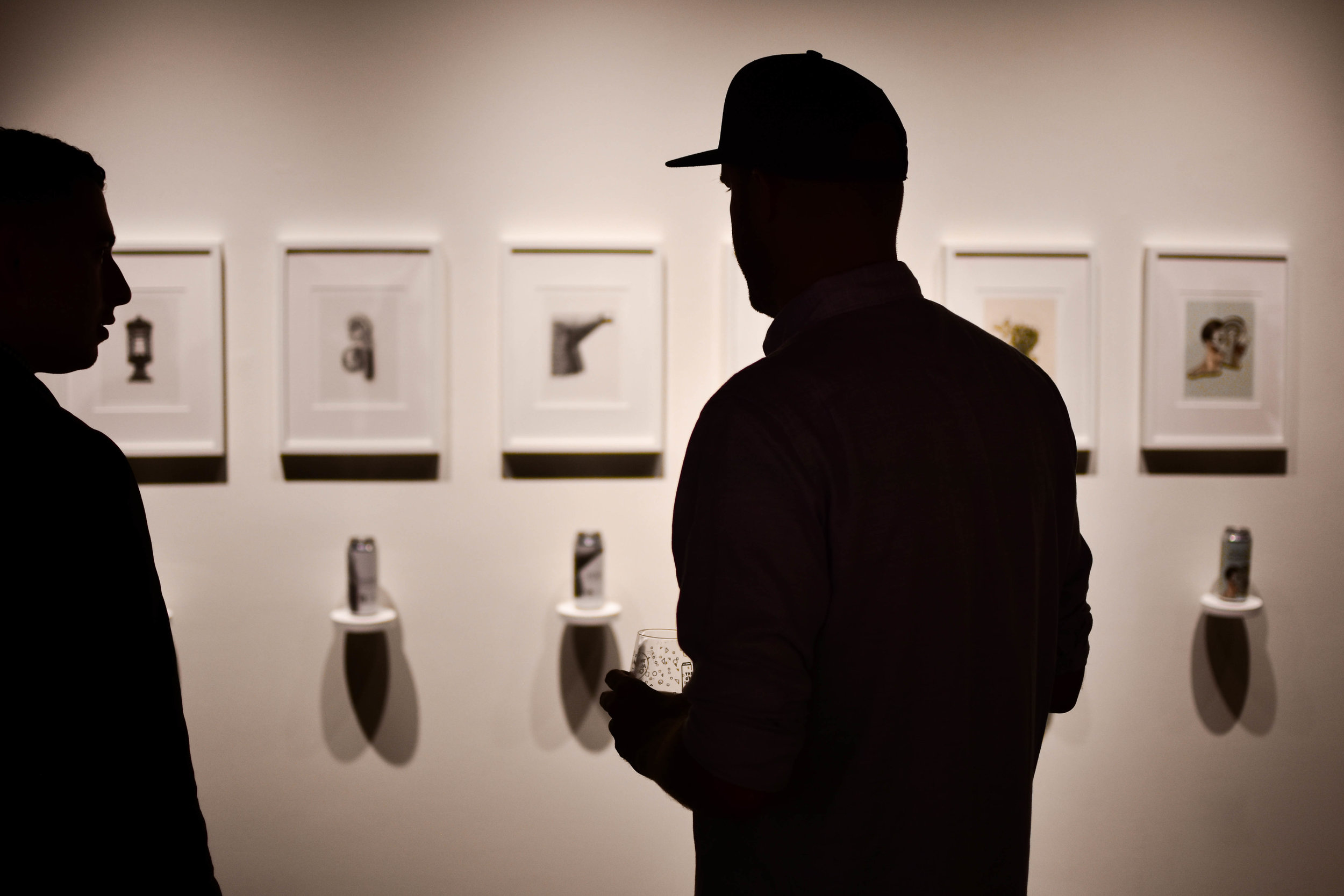
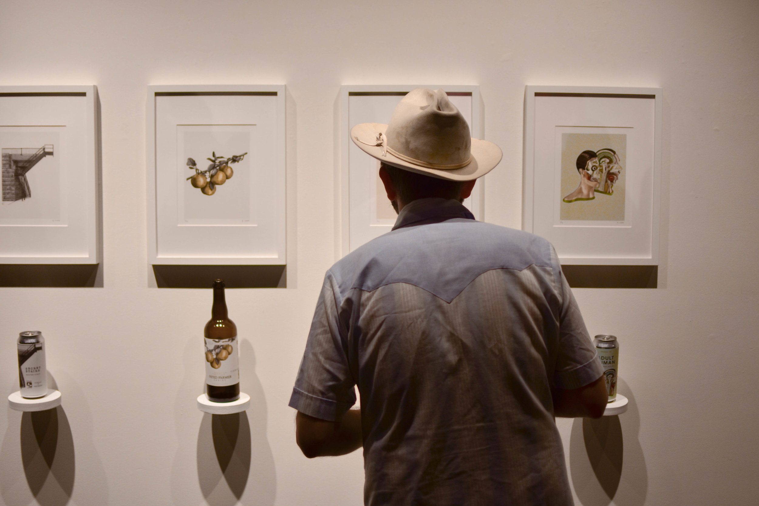
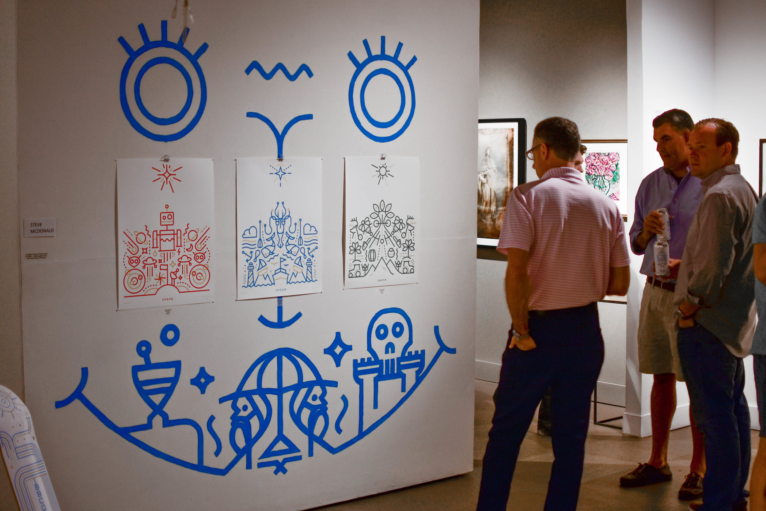
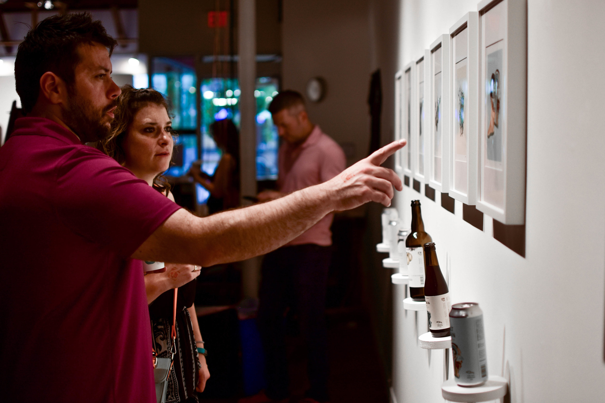
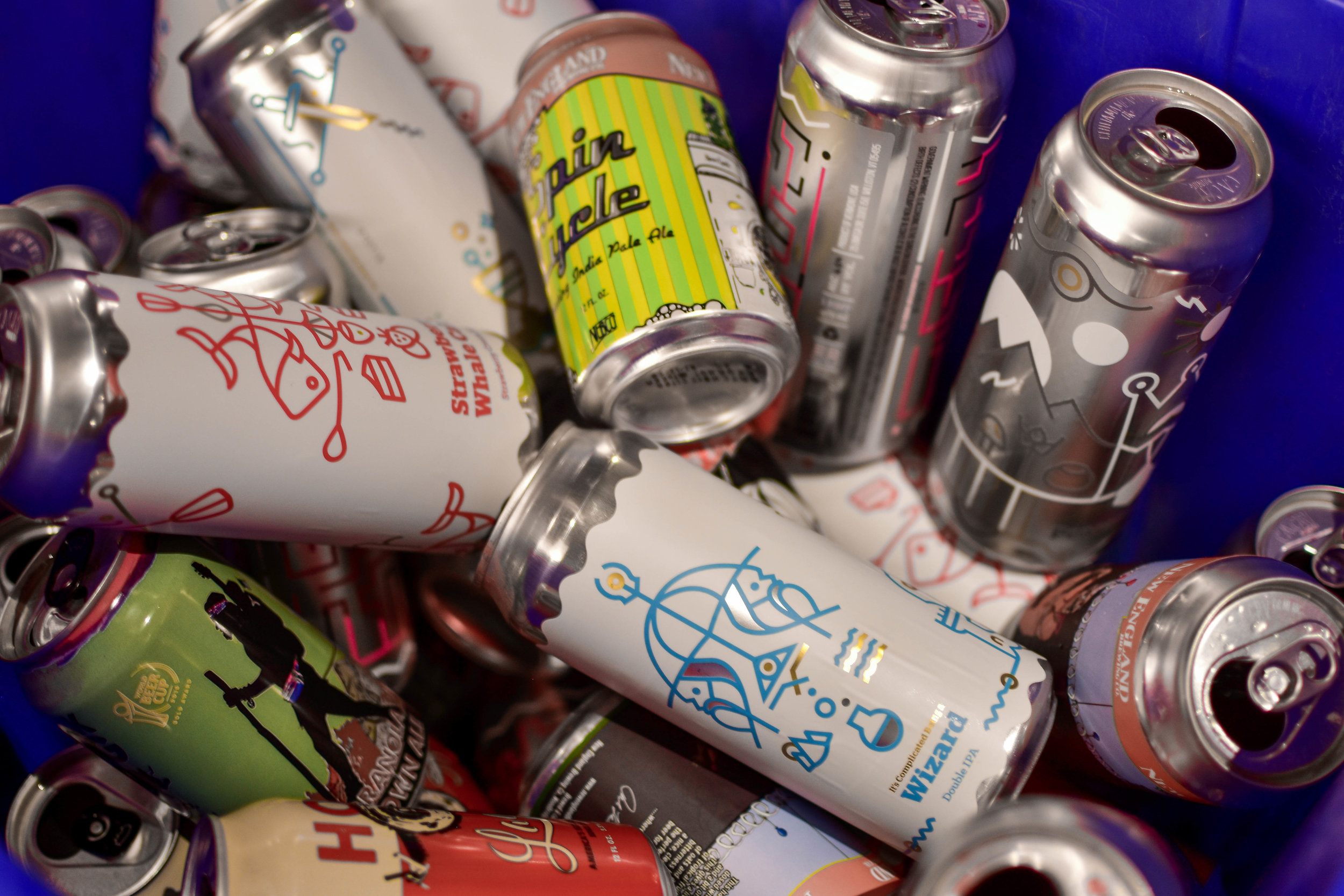
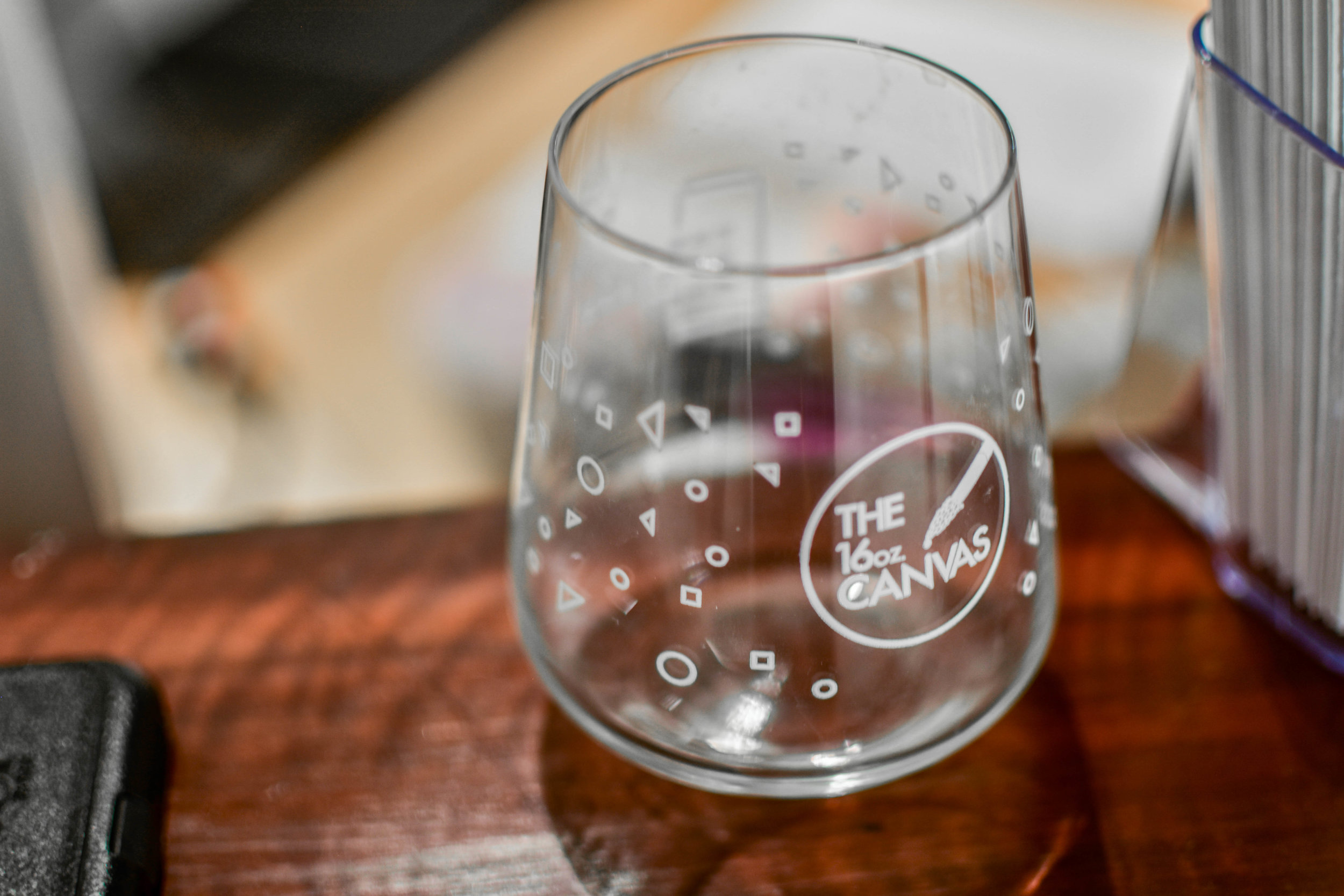
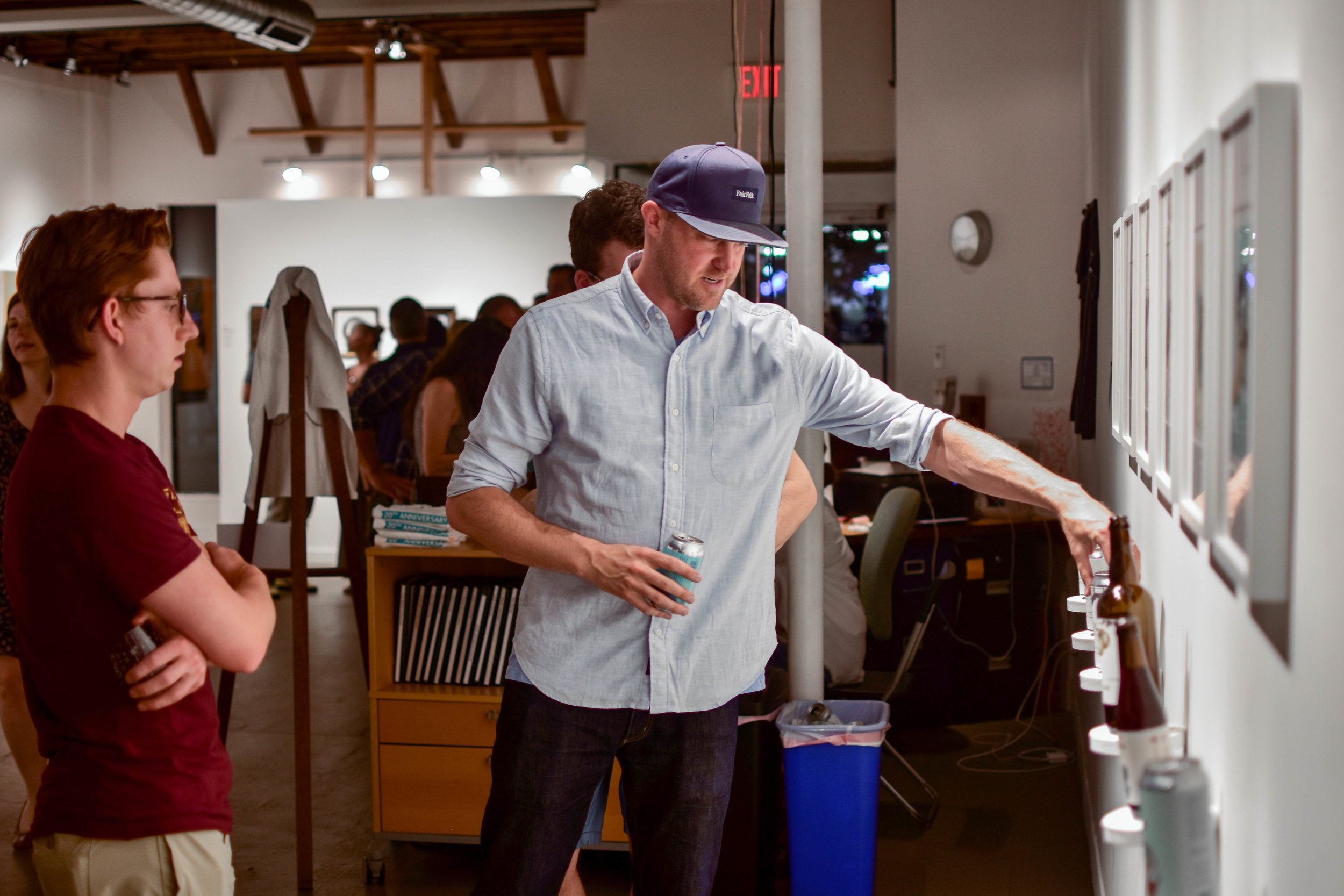
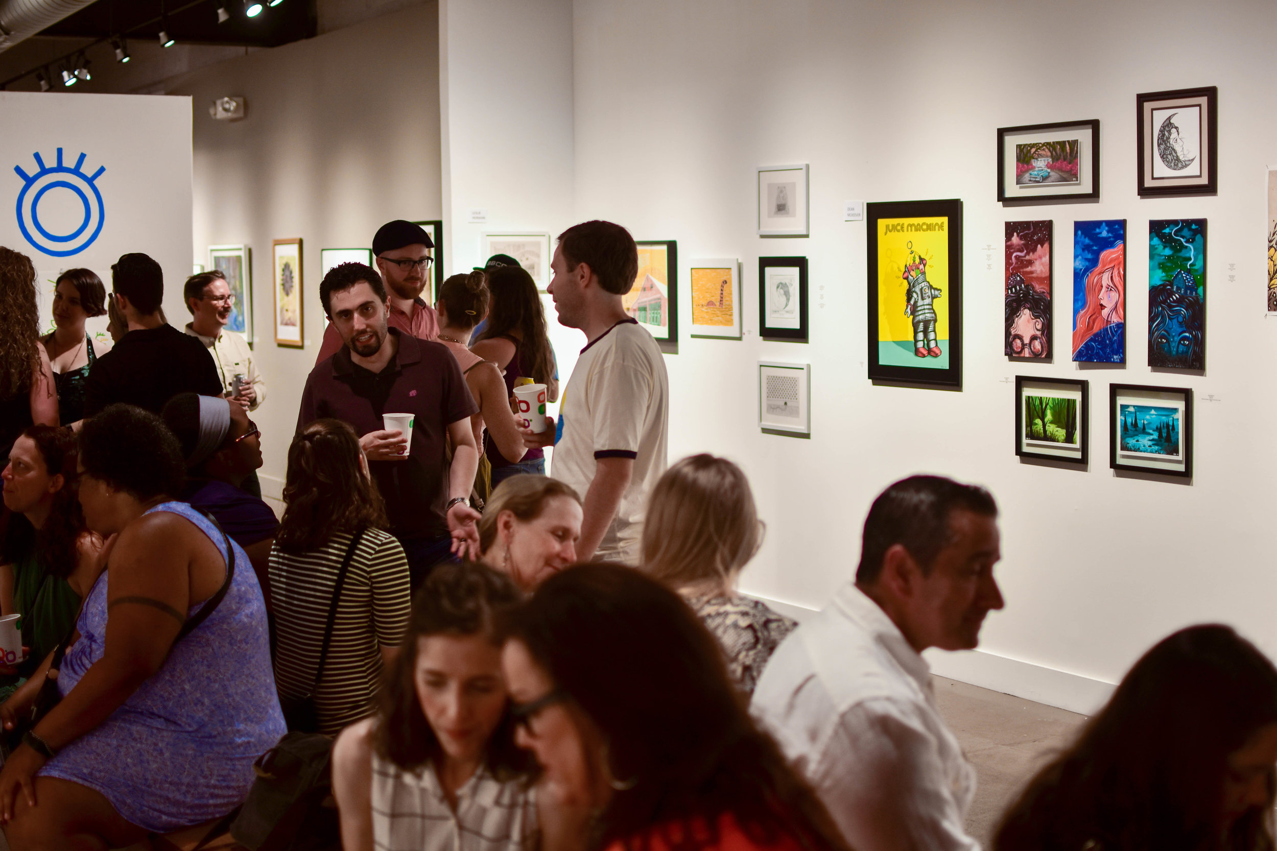
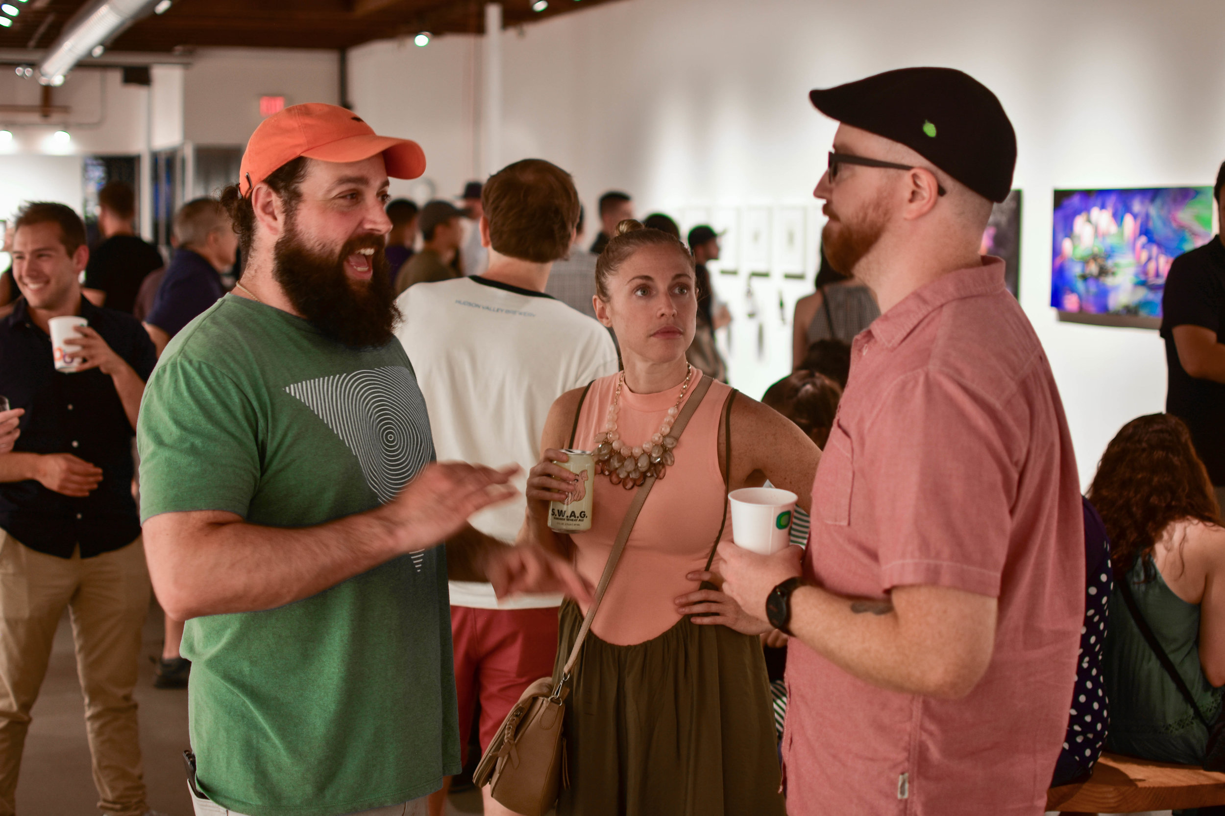
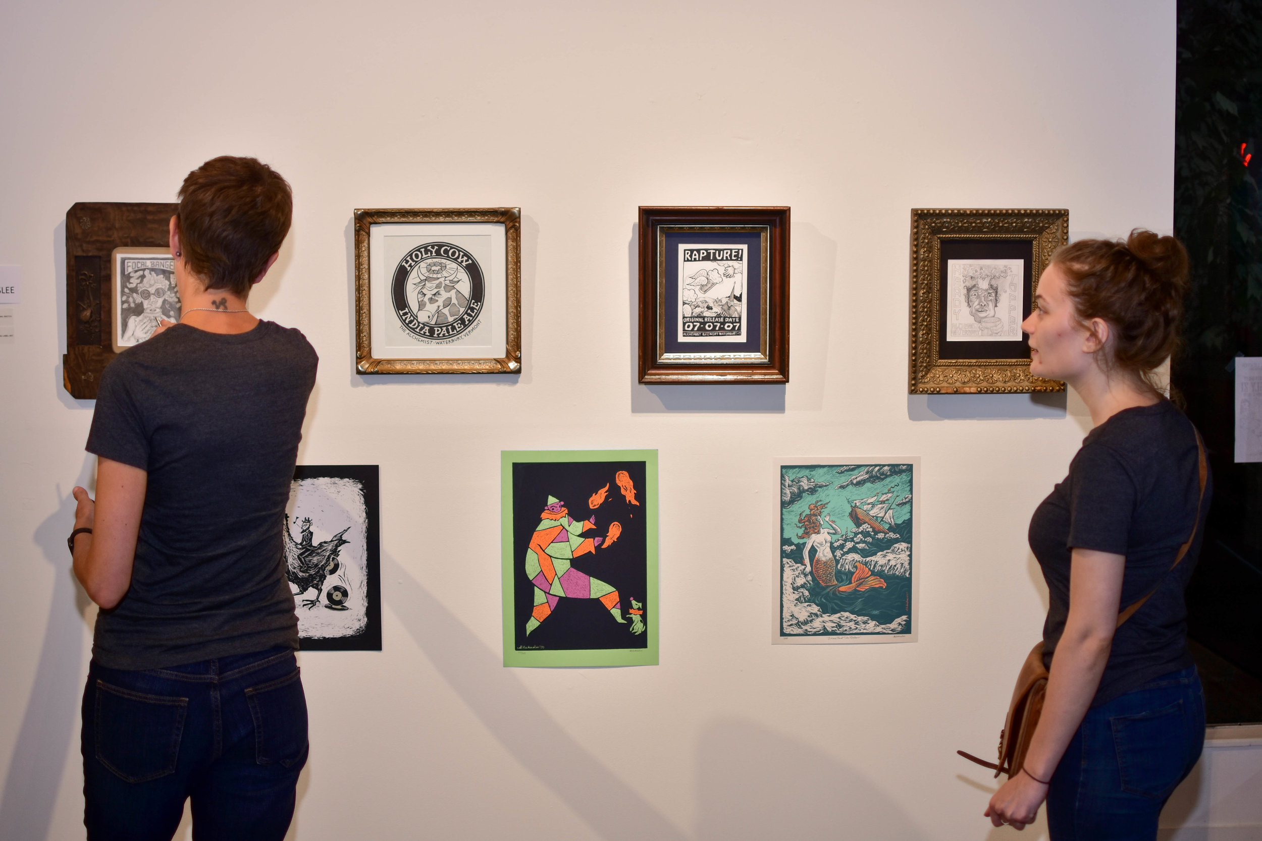
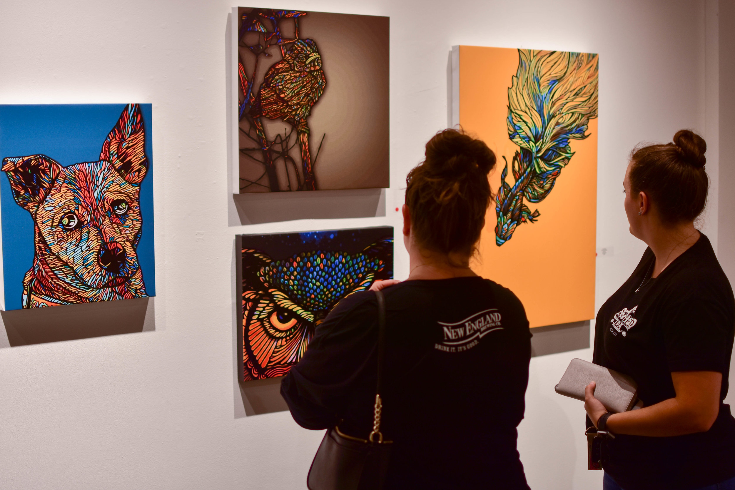
Shelton, CT, June 6, 2018– We here at The 16oz. Canvas are happy to announce our seventh 12-pack of artists today. Each week we introduce our audience to artists, designers and illustrators from around the world that help bring our favorite beers and breweries to life. Each week is an exciting introspective into an important but niche piece of the industry. The beauty of this project is not only do we learn about their process, but their stories of hard work and entrepreneurship that inspires so many.
Shelton, CT, June 6, 2018– We here at The 16oz. Canvas are happy to announce our seventh 12-pack of artists today. Each week we introduce our audience to artists, designers and illustrators from around the world that help bring our favorite beers and breweries to life. Each week is an exciting introspective into an important but niche piece of the industry. The beauty of this project is not only do we learn about their process, but their stories of hard work and entrepreneurship that inspires so many.
1) Background Info about you and your art
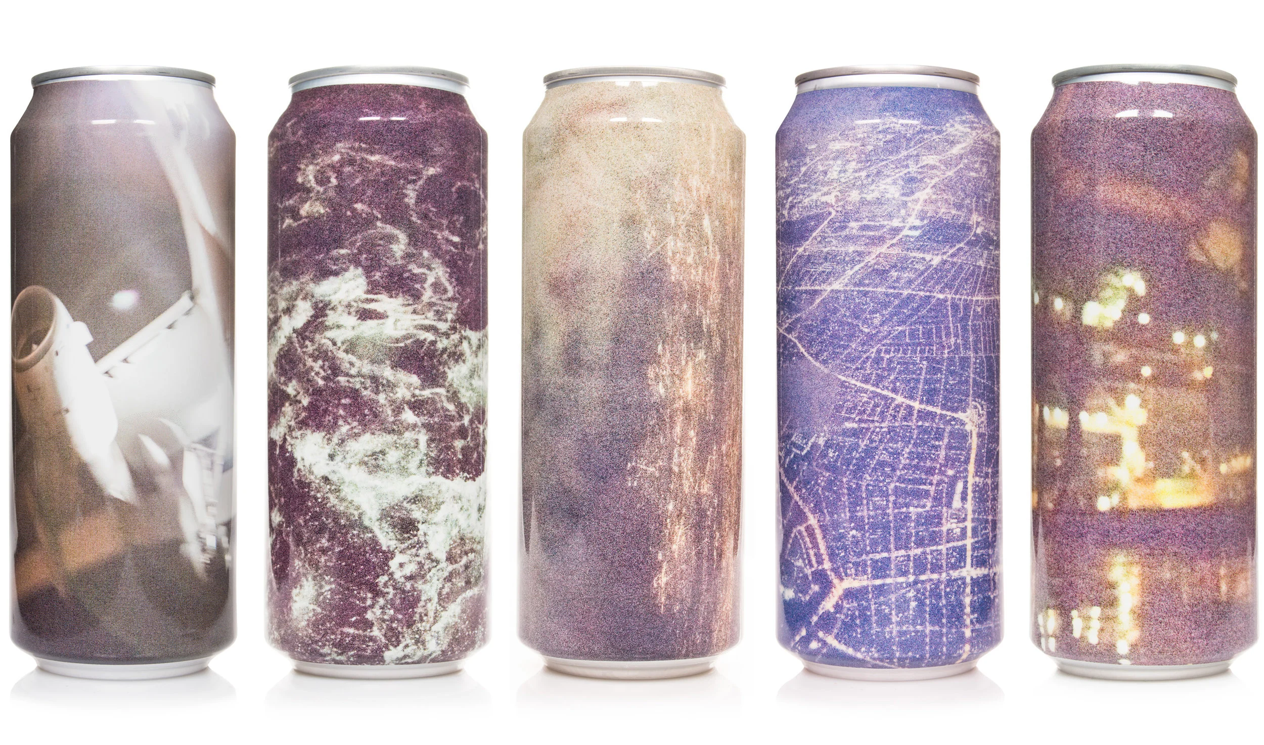
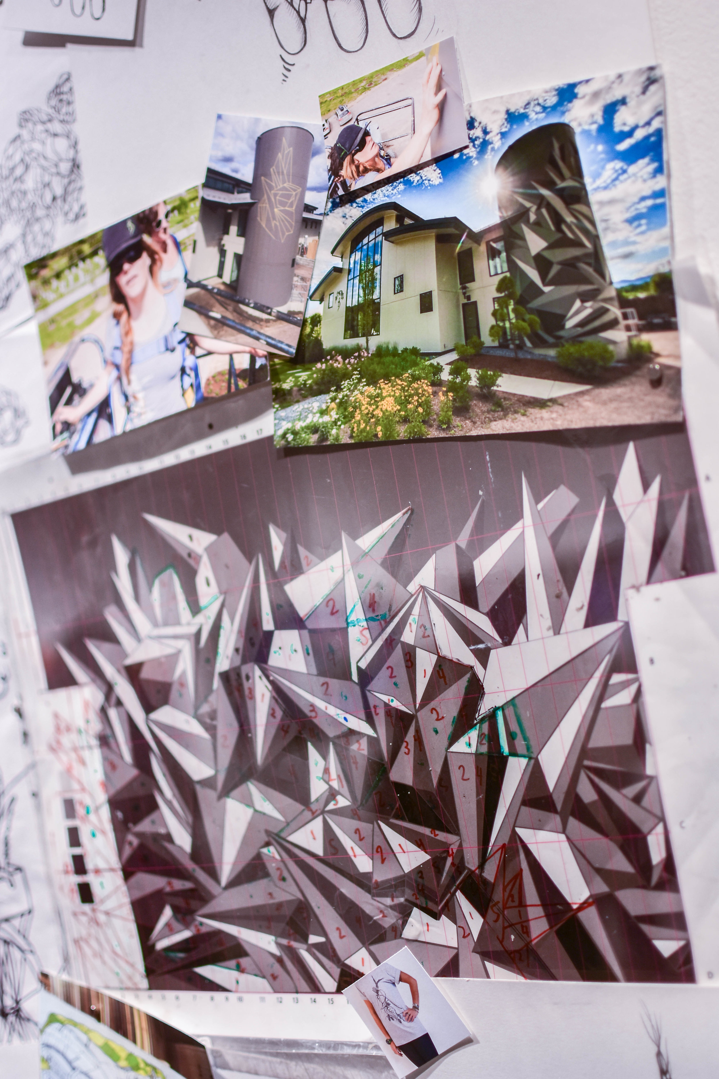
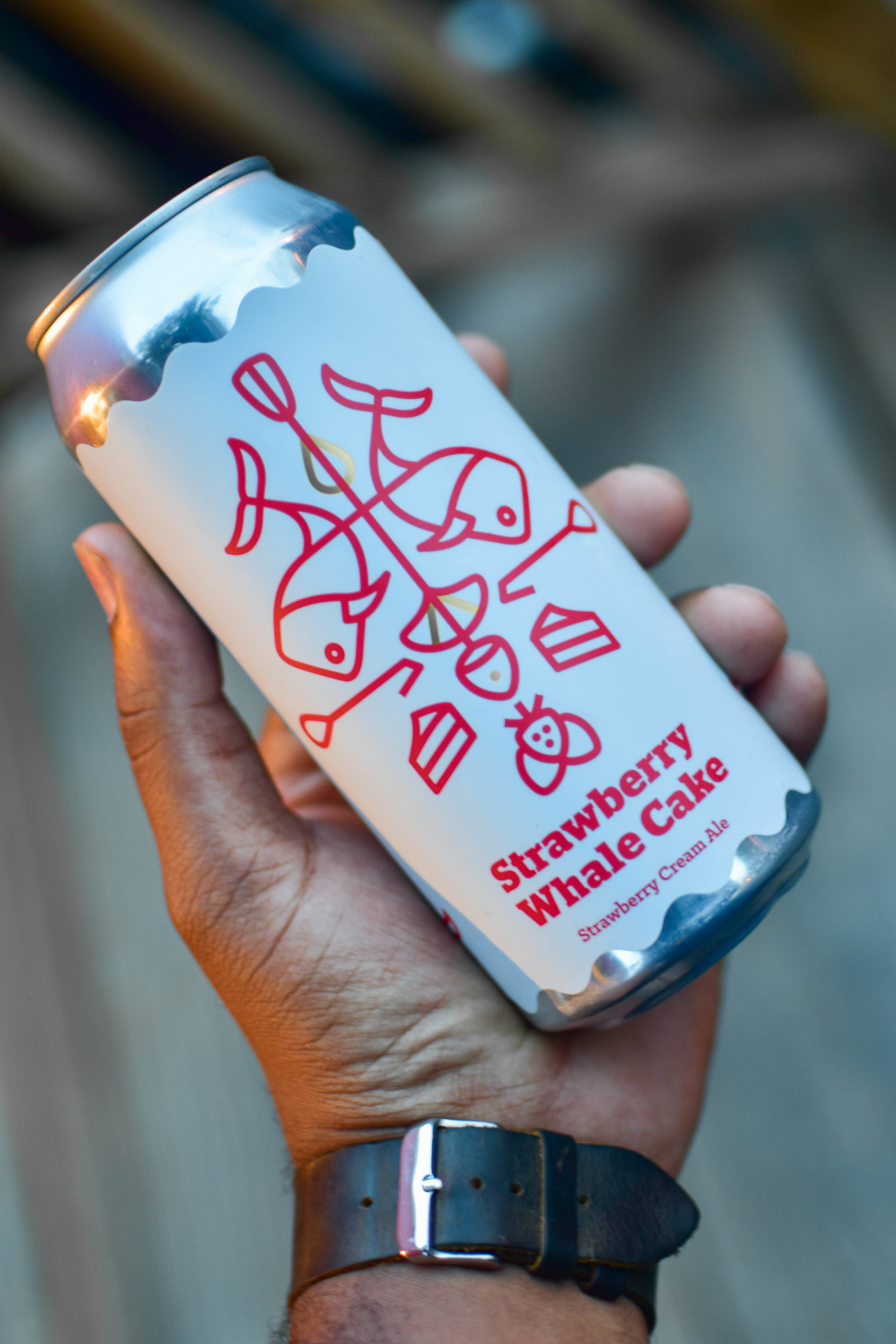
My name is Kasper Ledet. I’m a self taught graphic designer and photographer who lives and works in Copenhagen.
2) How would you describe your aesthetic
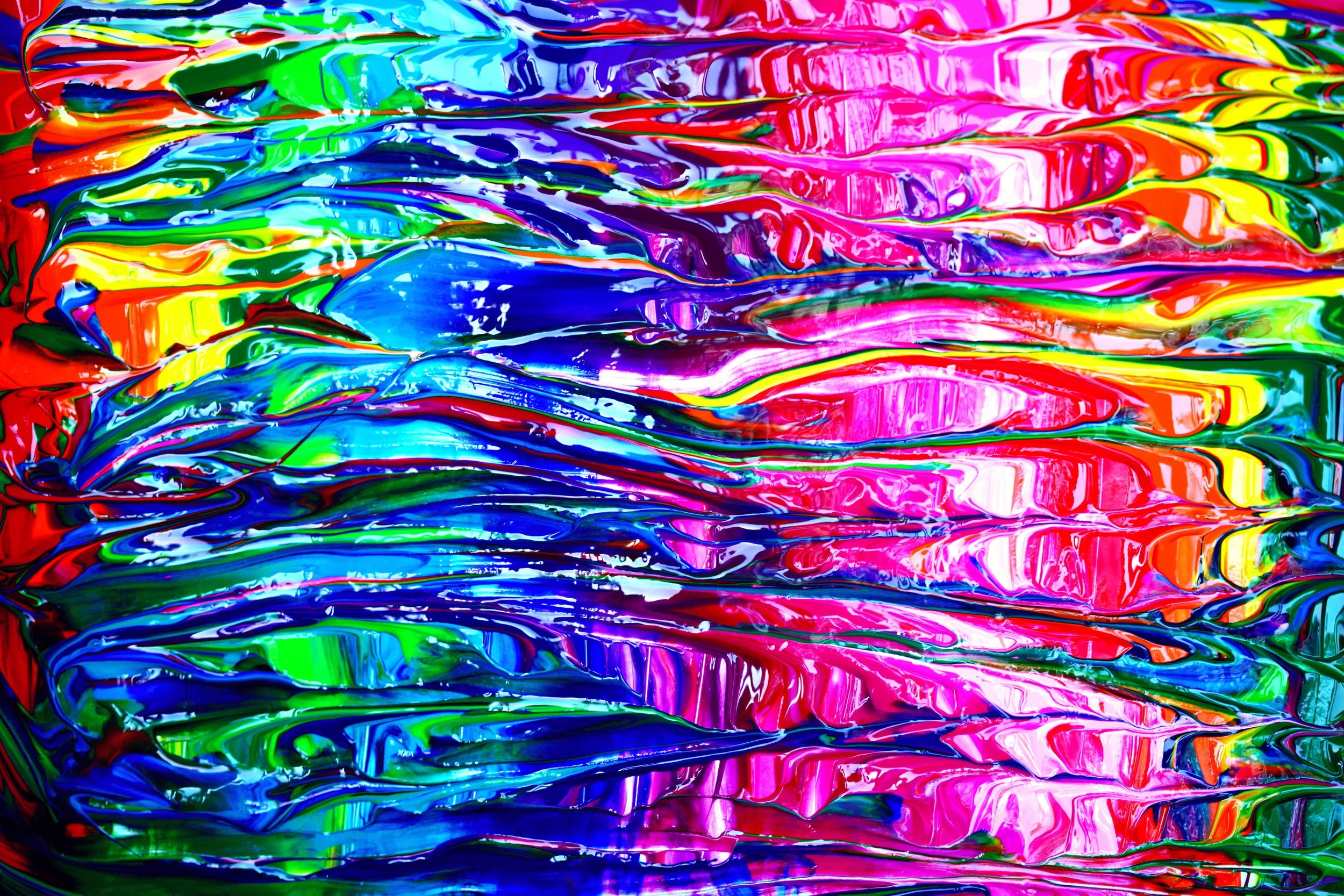
I guess that the graphic design tradition of Denmark plays a part in my work. Designers like Bo Linnemann from Kontrapunkt has shaped the public and corporate visual landscape of Denmark in a kind of humanist aesthetic through typefaces, layouts and sigs. This aesthetic approach can properly be traced back to mid century modernist like Arne Jacobsen and Poul Henningsen (maybe even earlier) and is deeply tied to the Social Democratic welfare state which also conquered the other Scandinavian countries. I believe it is important to be critical of this aesthetic even though I’m a strong supporter of the welfare state. Public Danish institutions like schools, kindergartens and libraries was marinated in this visual language when I was growing up so it has definitely influenced me and my work for better or worse.

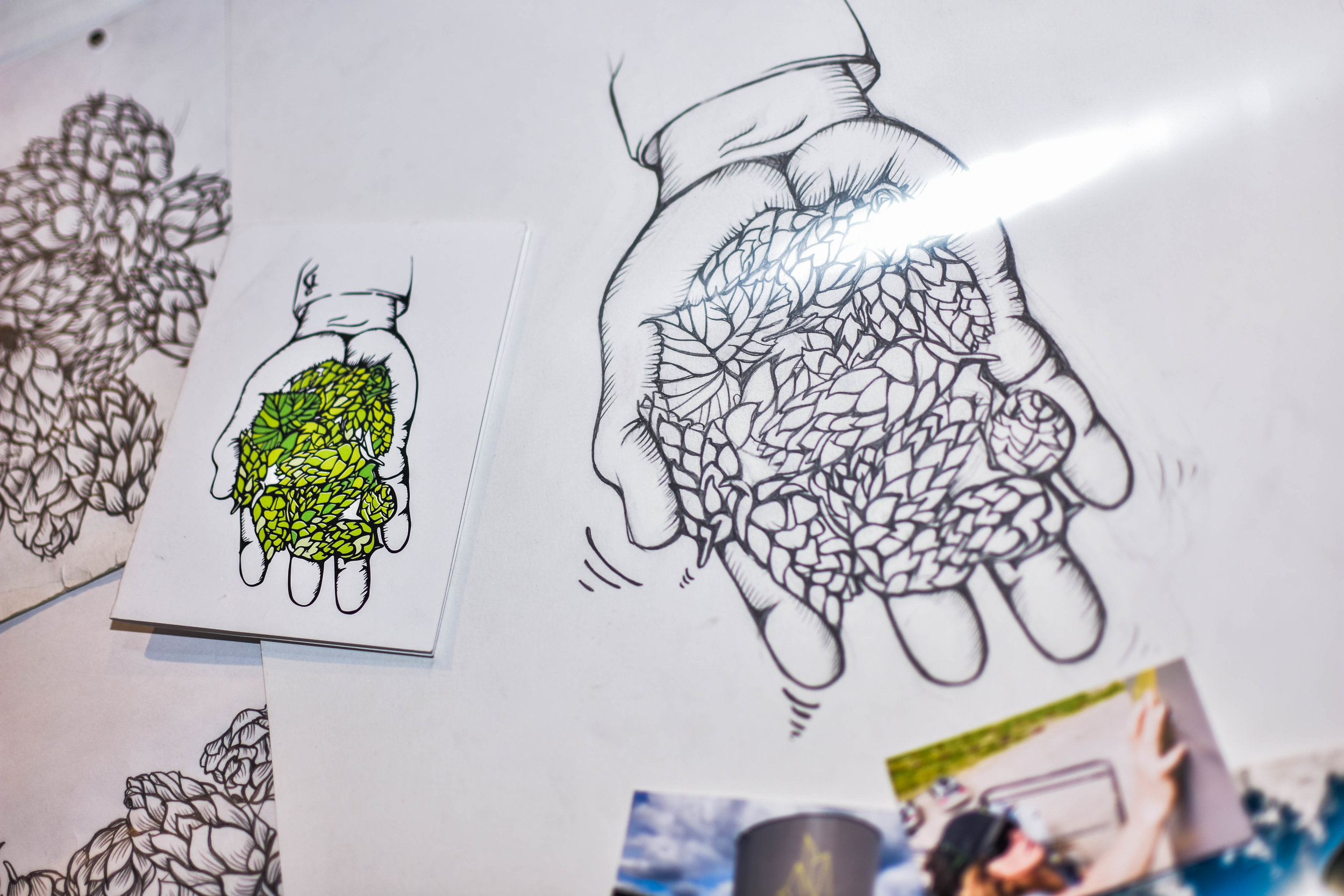
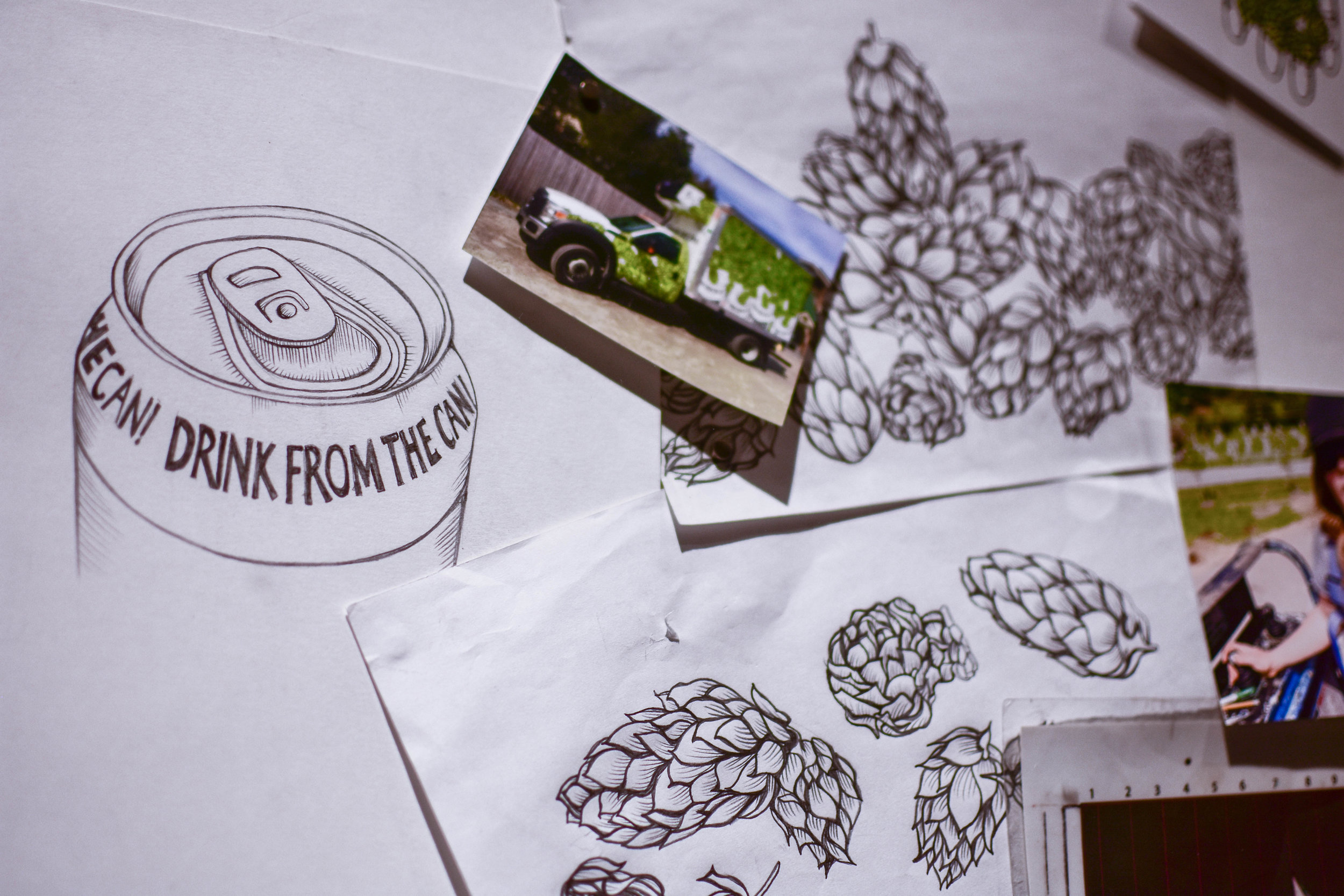
3) What is your process (like the mechanics of your work) - i.e. illustrator? photoshop? hand drawn or a hybrid
The photography is done with digital cameras. Post processing, layouts and typography is done with the Adobe programs. Additionally I’m using a Wacom drawing tablet.
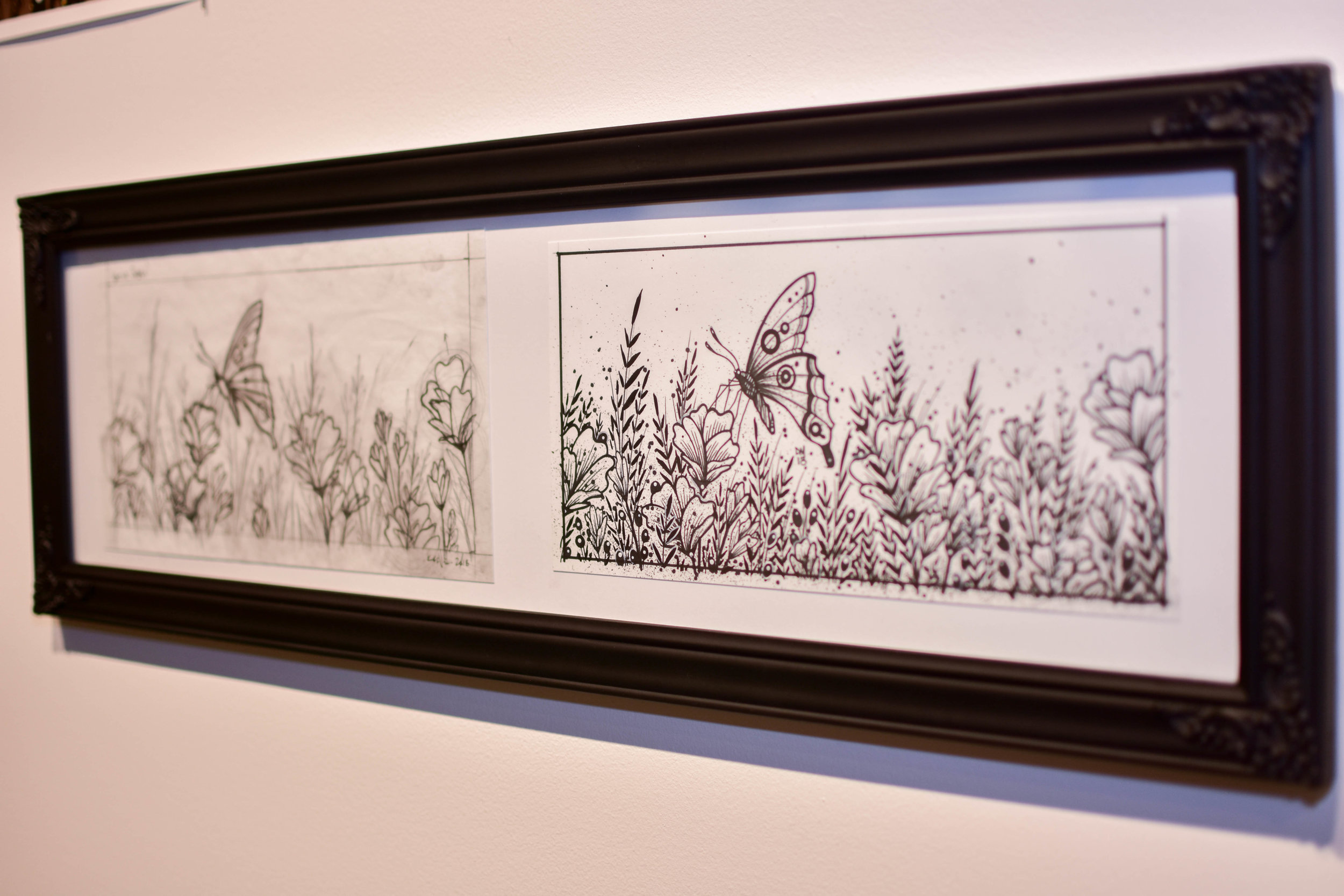
Since most of the designs are conceptual in one way or another the process often starts with thinking and researching. Drawing is not a very central tool in my creative process. For me drawing works good as a way of communicating ideas fast to others, but drawing as a way to develop form or ideas is something that I almost never do.
The point is that the tools you use in the process affects the final outcome. In that sense I don’t consider drawing to be a neutral tool for all creatives to use. It is basically biased. It will yield curtain results, just like a more intellectual approach is also biased and drives the work in a certain direction. I don’t really think it is important which approach you use just that you are aware that the tools are not neutral.
This point of view is actually a bit controversial in Denmark particular within Danish design education. Traditionally Danish design has been closely linked to craftsmanship. Many of the mid century architects and designers had backgrounds as carpenters, cabinet makers or other artisan crafts. For them drawing was a natural extension of their background. They achieved world wide recognition and success for their Danish furniture and architecture. Since most of them used drawing as a central way to achieve and develop form this was elevated to be the only acceptable tool in Danish design for many years to come. It almost led to an anti intellectual discourse among the design elite and educational institutions. Luckily things are starting to soften up with newer generations of designers also embracing critical thinking and philosophy as a way to understand the world around them.

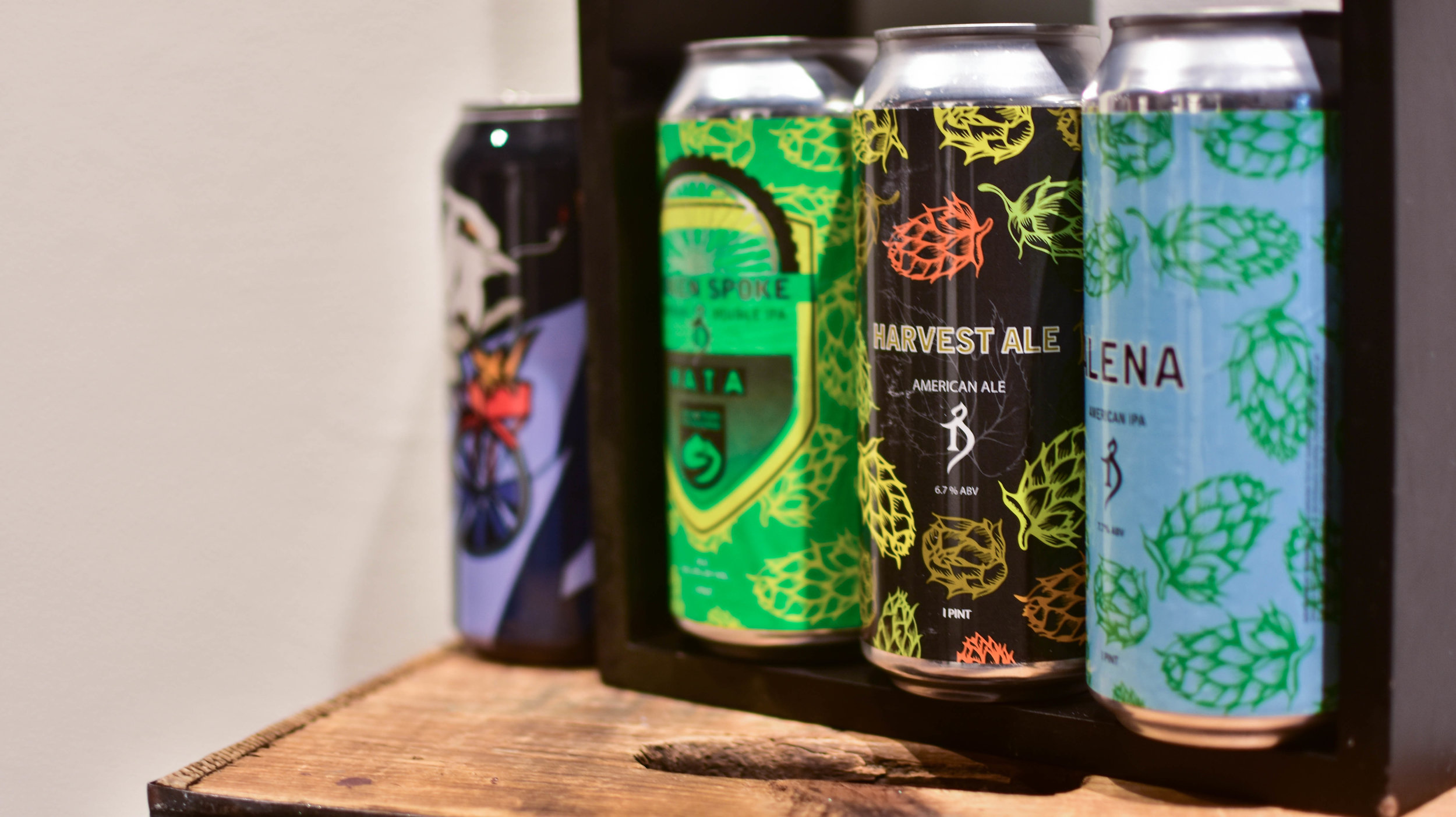
4) How did you come to work with To Øl ?
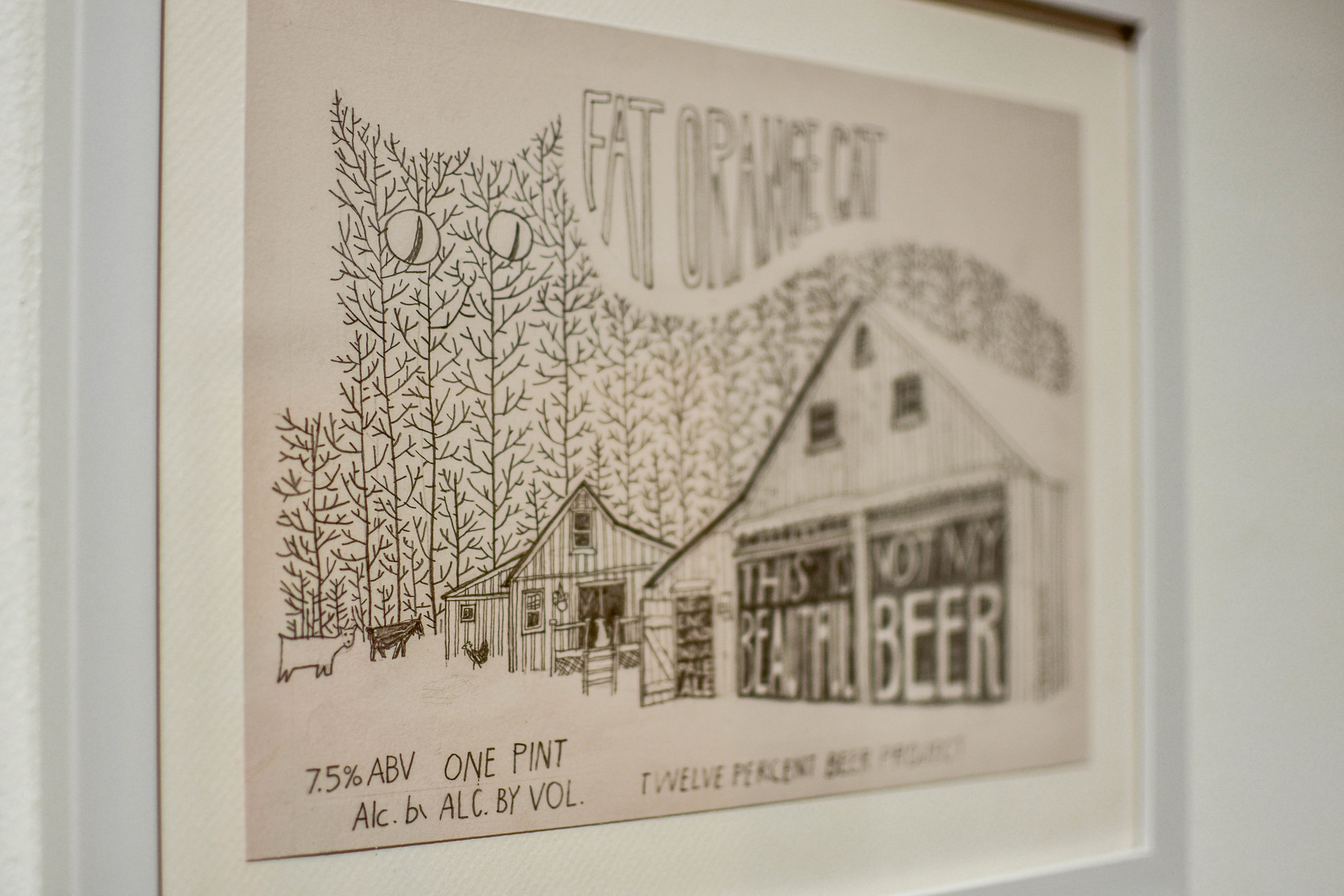
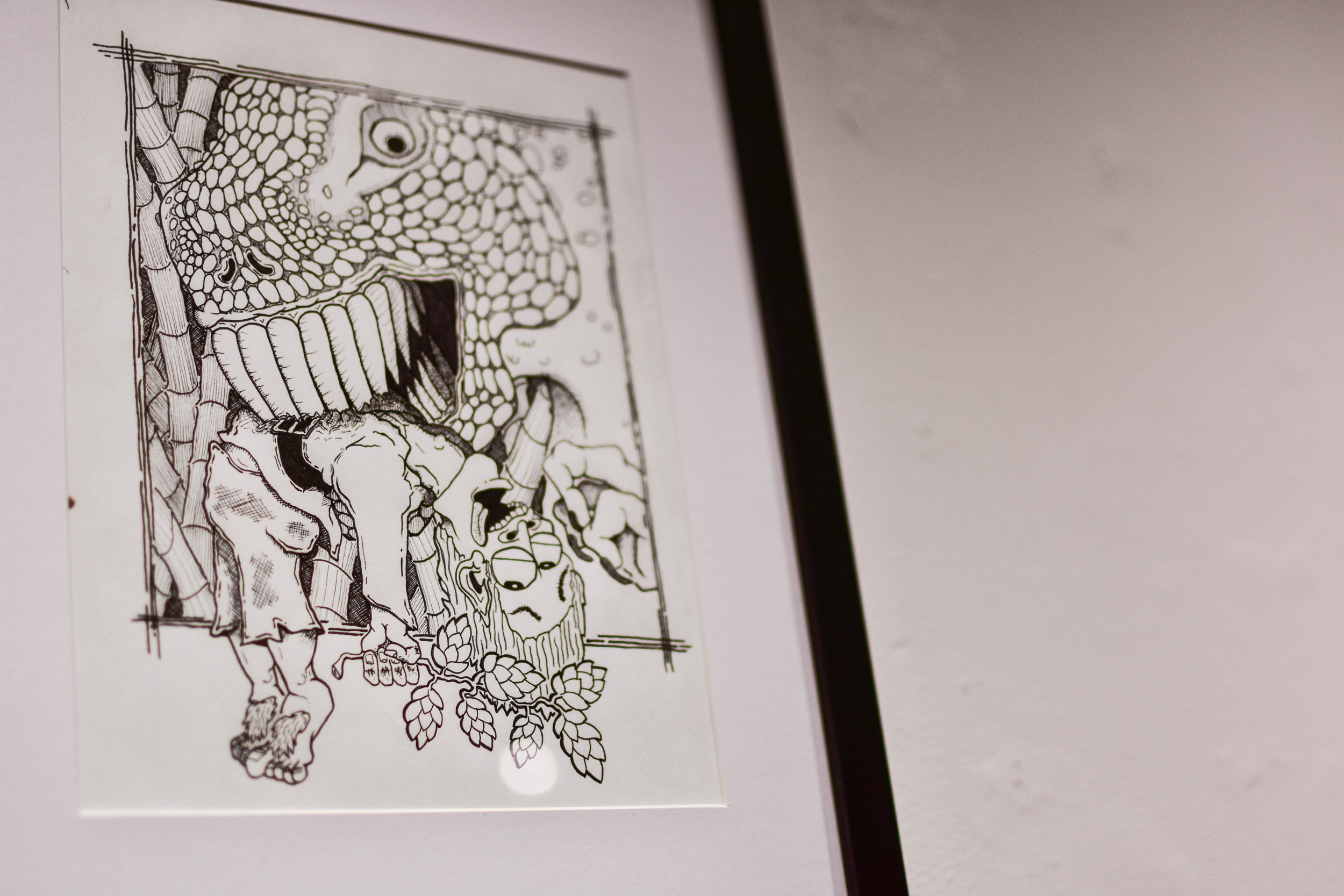
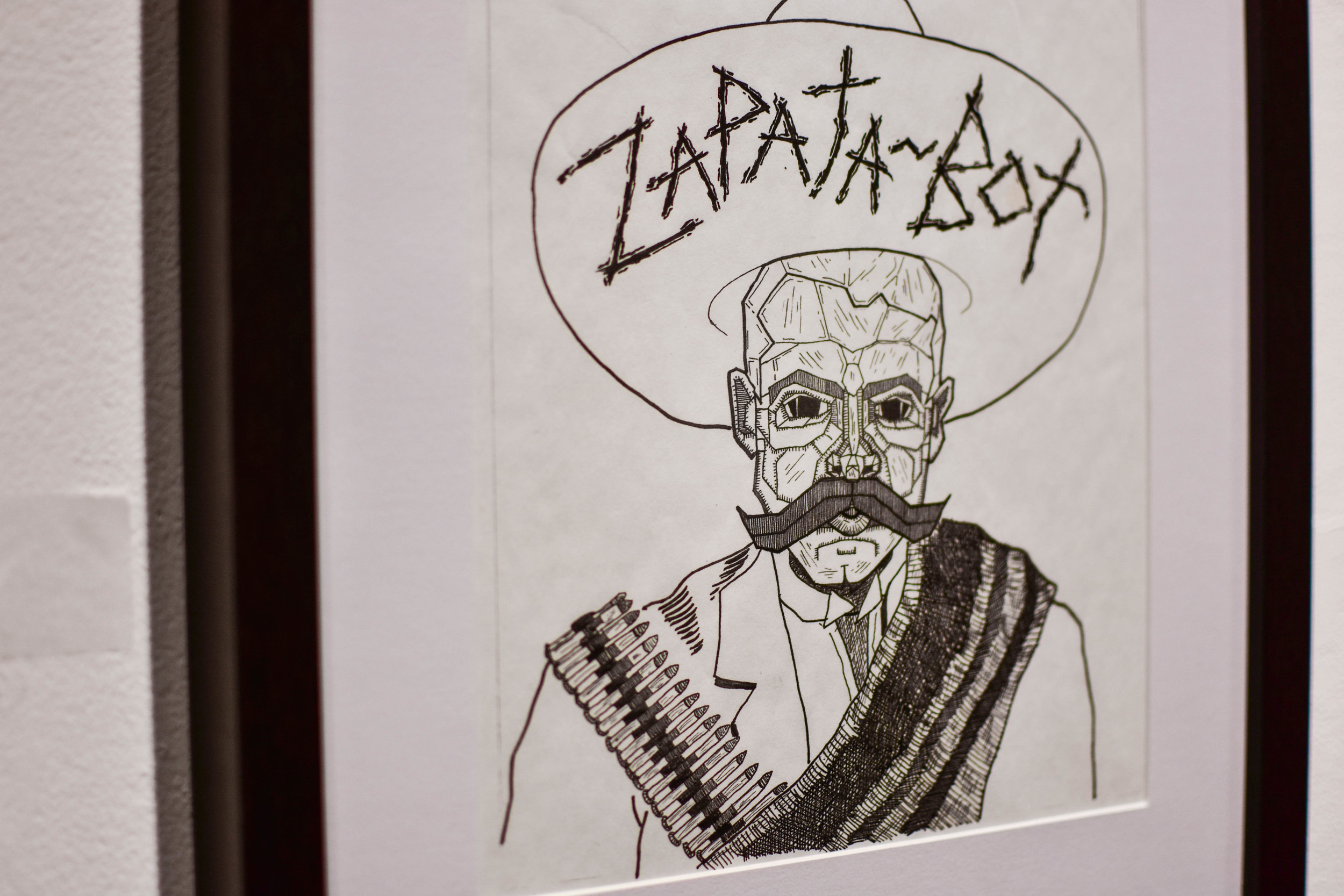
I attended the same high school as the founders of To Øl. Back then they started to experiment with brewing small batches in the school’s kitchen. At the same time I also started to play around with graphic design and illustration so they asked me to do a label for them. It was done on a xerox machine and pasted on the bottles by hand. This was back in 2006-2007. In 2010 To Øl produced their first commercial beer and they called me again to do the artwork. I have been onboard ever since.
5) Process with the Brewery
- Do you have artwork that you present to them and they pair it with a beer
It is always a process that involves discussion and sketching. It could very well be that we end up using a photo that I have shot years before but seems conceptually right for a certain beer.
- How much time / notice do you have from discussion to release?
Usually we are about half a year ahead of release.
- Do the brewers have a vision or theme they want to be represented in the art?
The brewers usually has something they want to express with the beer and we have a discussions on how that vision can be incorporated into the artwork. These discussions can be really abstract. We actually often use music as an analogy. Is this beer a dark post punk track or a happy nineties dance tune. It is a sessionable pop song or a challenging avant garde noise recording.

6) How / Is creating for a smaller canvas like a can or bottle different than you a typical project?
Their is of course some technical differences but I would like to question the usual notion of scale on a more conceptual level. I studied for a brief period at The School of Architecture here in Copenhagen. Everything was divided into their apparent scale. Furniture and graphic design at one end of the spectrum, buildings in the middle and urban planning in the other end. Of course a can of beer is smaller than a building but as opposed to most buildings a can of beer may be reproduced in several hundred thousand copies and distributed all over the world. Just think about the cultural impact that some pieces of graphic design, like record sleeves, has made. The cover for Pink Floyd’s Dark Side of the Moon is probably a lot more influential than many buildings even though it is just two 12” pieces of cardboard glued together with a record inside. The conservative notion of scale can be helpful to sought out practical problems. But on an artistic level it is really counter productive. I very much regard graphic design, architecture and even fine art to be part of the same interconnected whole.
7) Are there other breweries and related artwork that you really like or admire
Manchester based Studio DBD is doing some nice work for Track Brewery and also has a strong portfolio of other projects.
8) Working with a brewery has to have it perks - do you have favorite beers or styles?
Porters and stouts all the way!
9) In my former life I was a radio DJ. What type of music do you play when creating or looking to be inspired?
New Order and the rest of the gang from Factory Records, early nineties dance, Warp Records stuff, dark wave / post punk, Beck’s folk music records, David Bowie (including Let’s Dance - best pop record ever made). Bruce Springsteen, Copenhagen underground stuff, Kate Bush, all those great eighties / nineties one hit wonders, Lust for Youth, Moderat / Apparat, Tears for Fears, Massive Attack, Bjørk, Brian Eno, Talking Heads, occasionally Philip Glass, occasionally dark minimal techno.
10) Current projects
Some beers, some merchandize. A record sleeve for a band and a lot of secret stuff.